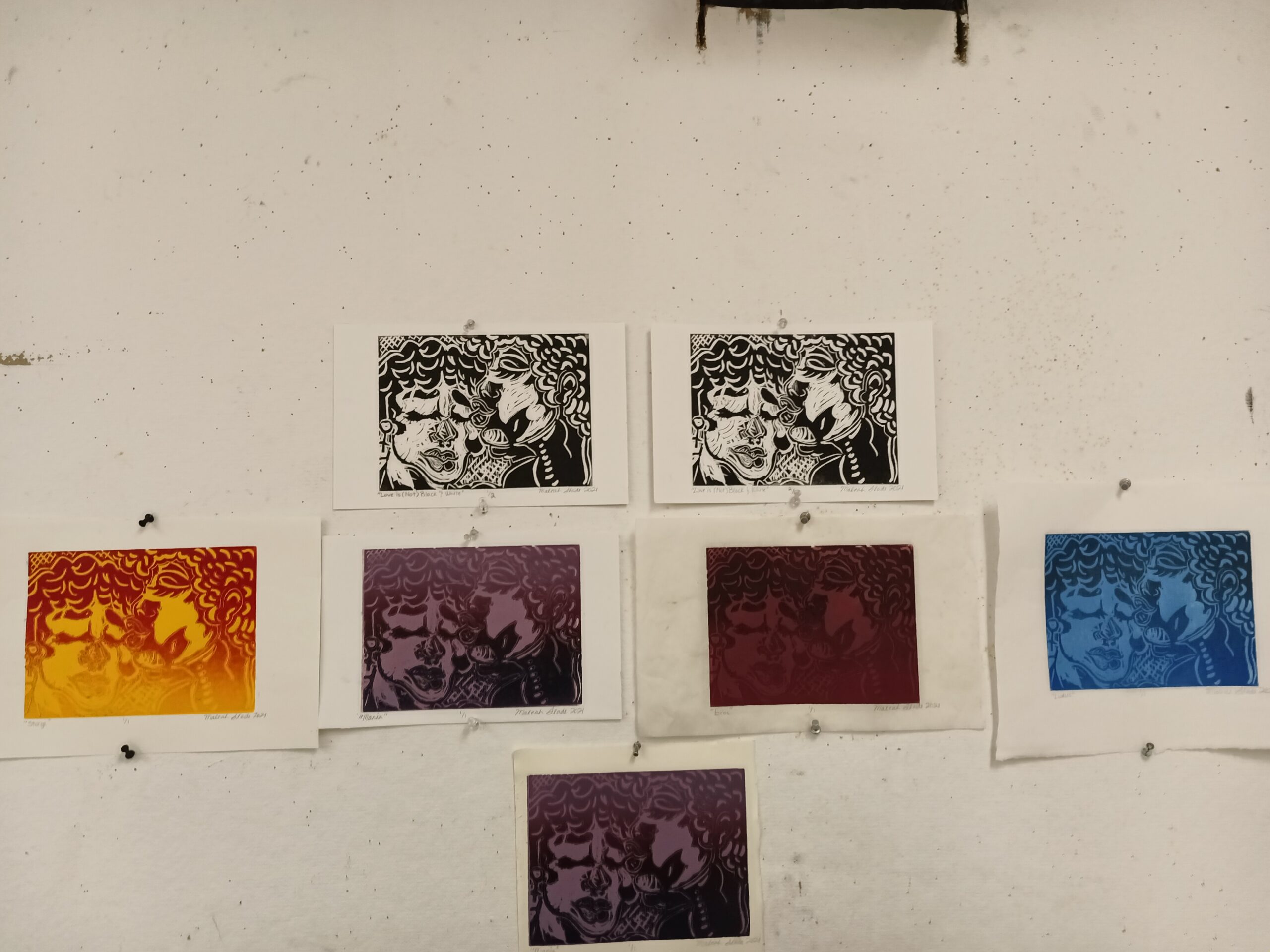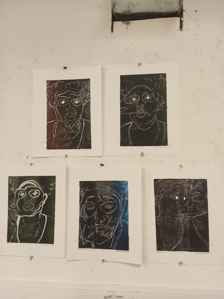
All Monoprints 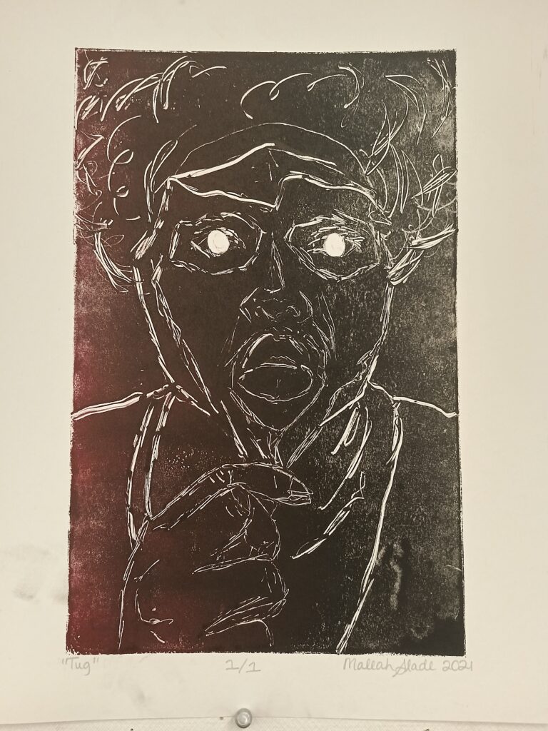
“Tug” 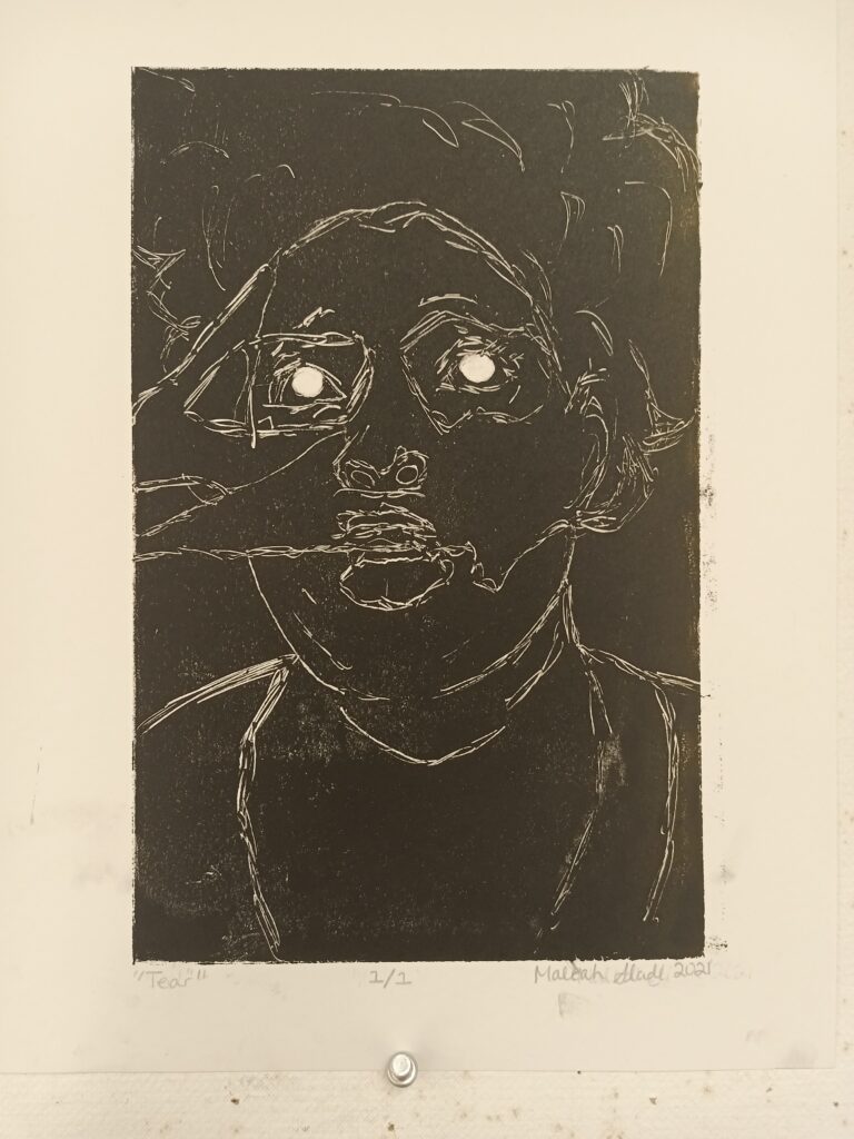
“Tear” 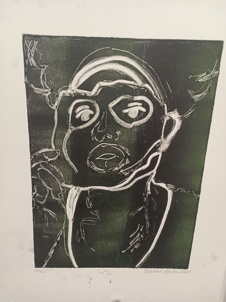
“Peel” 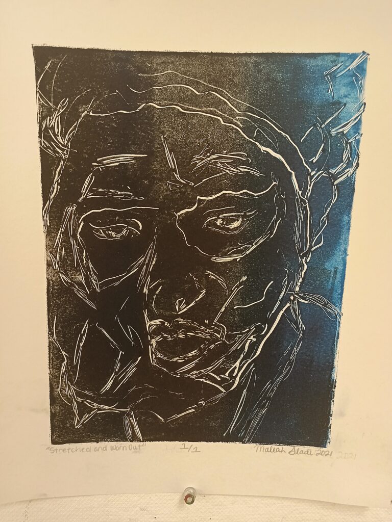
“Stretched and Worn Out” 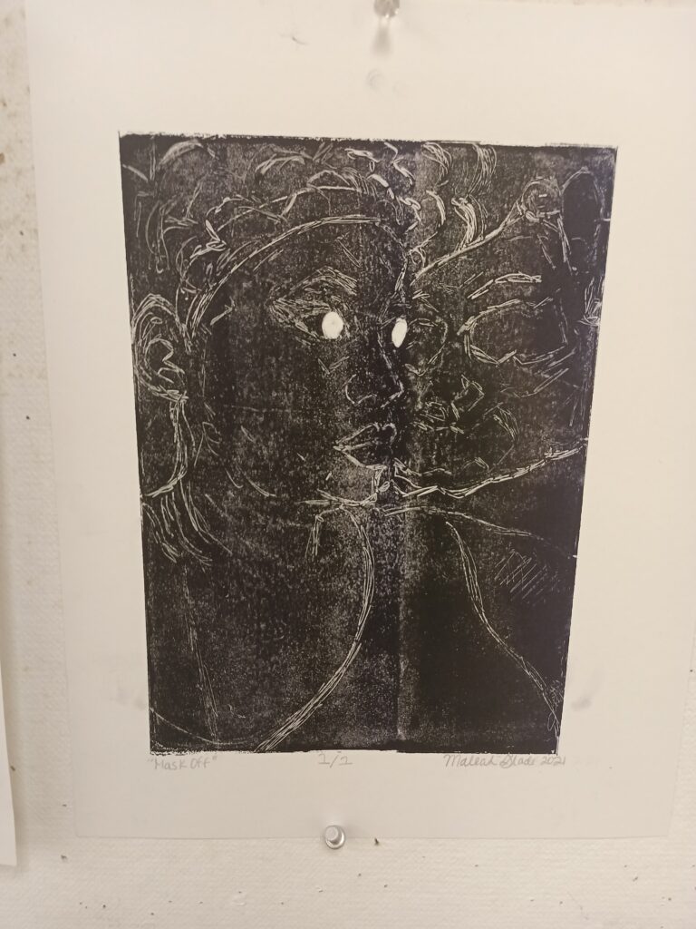
“Mask Off”

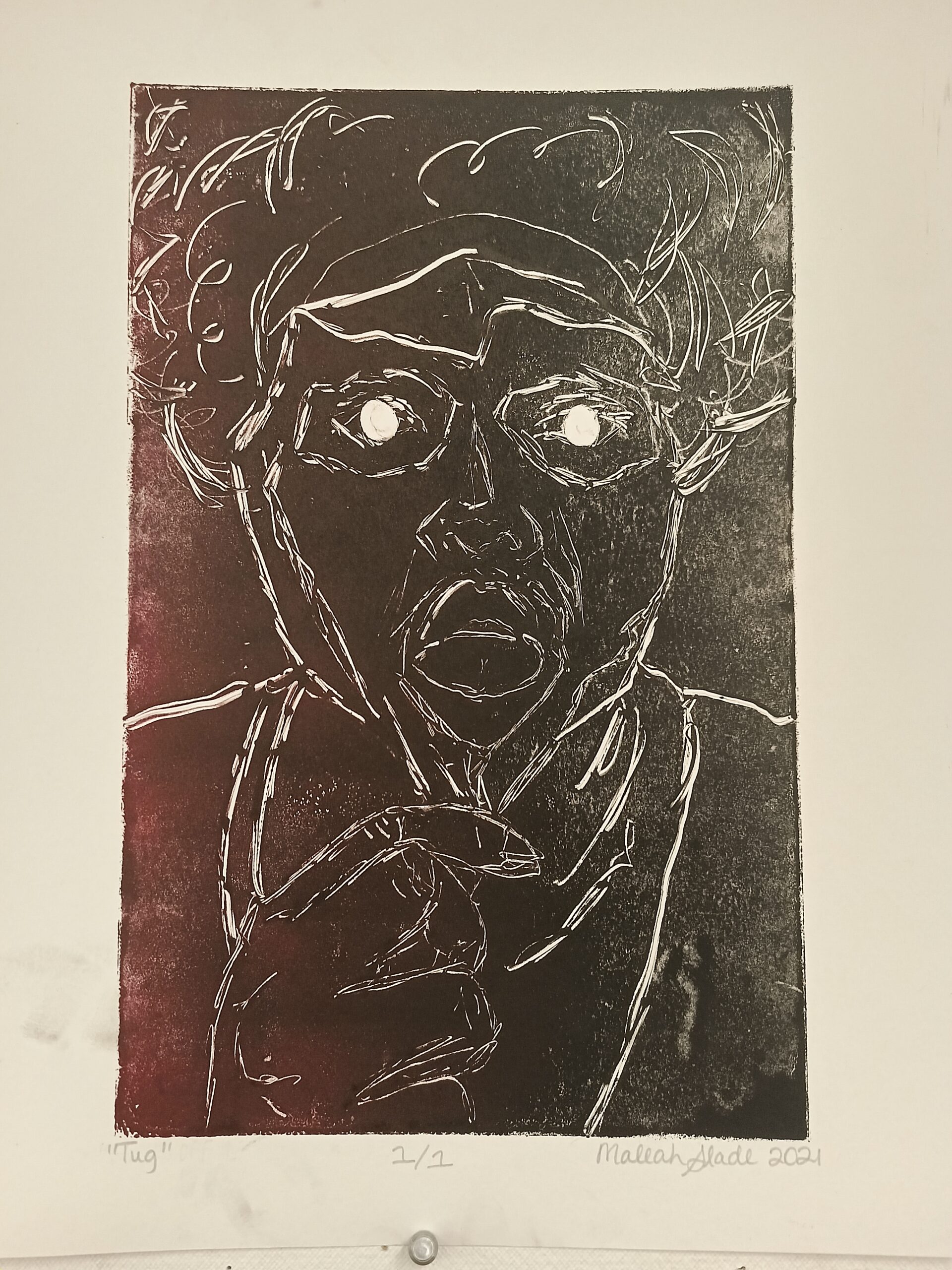
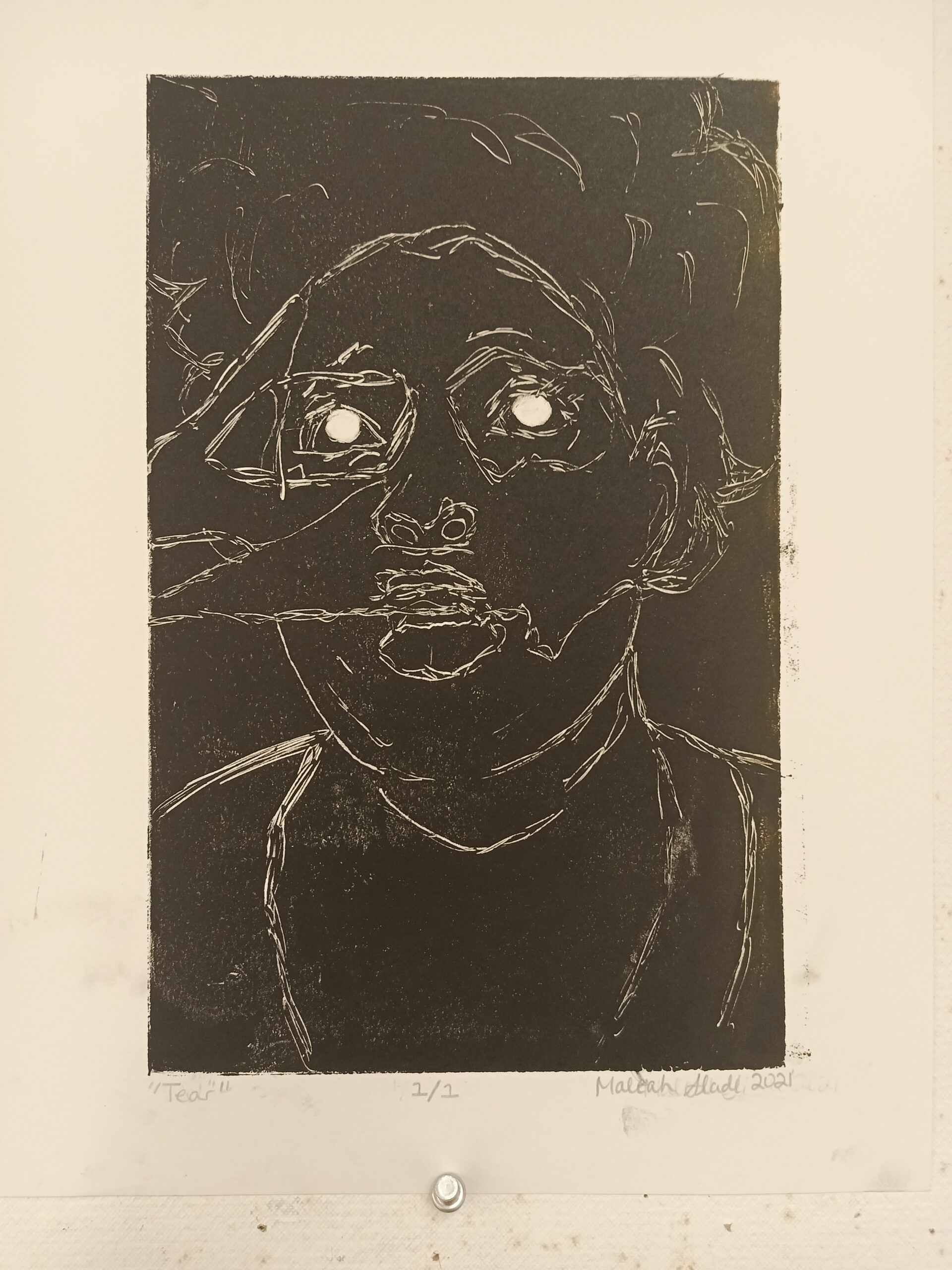


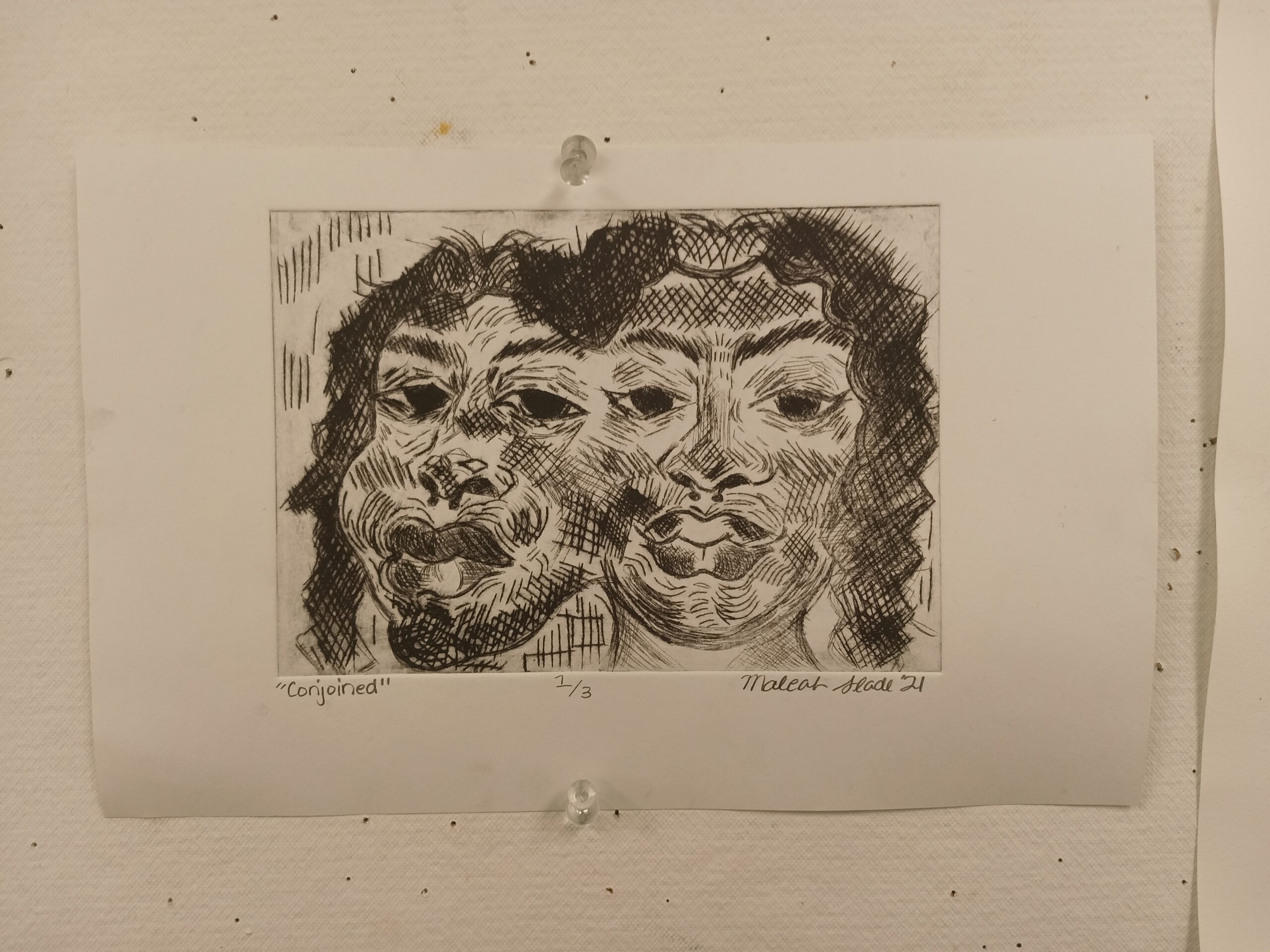
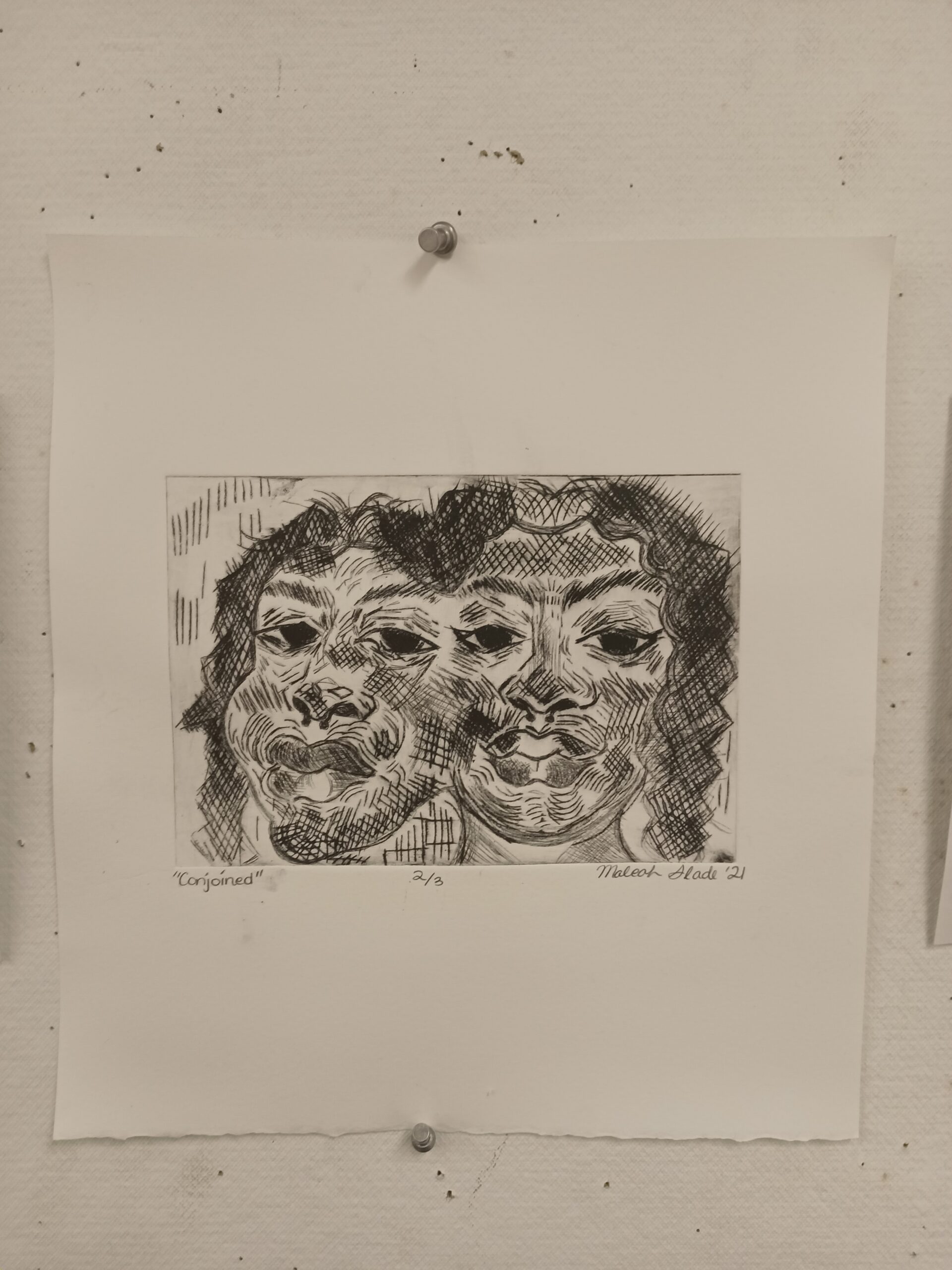
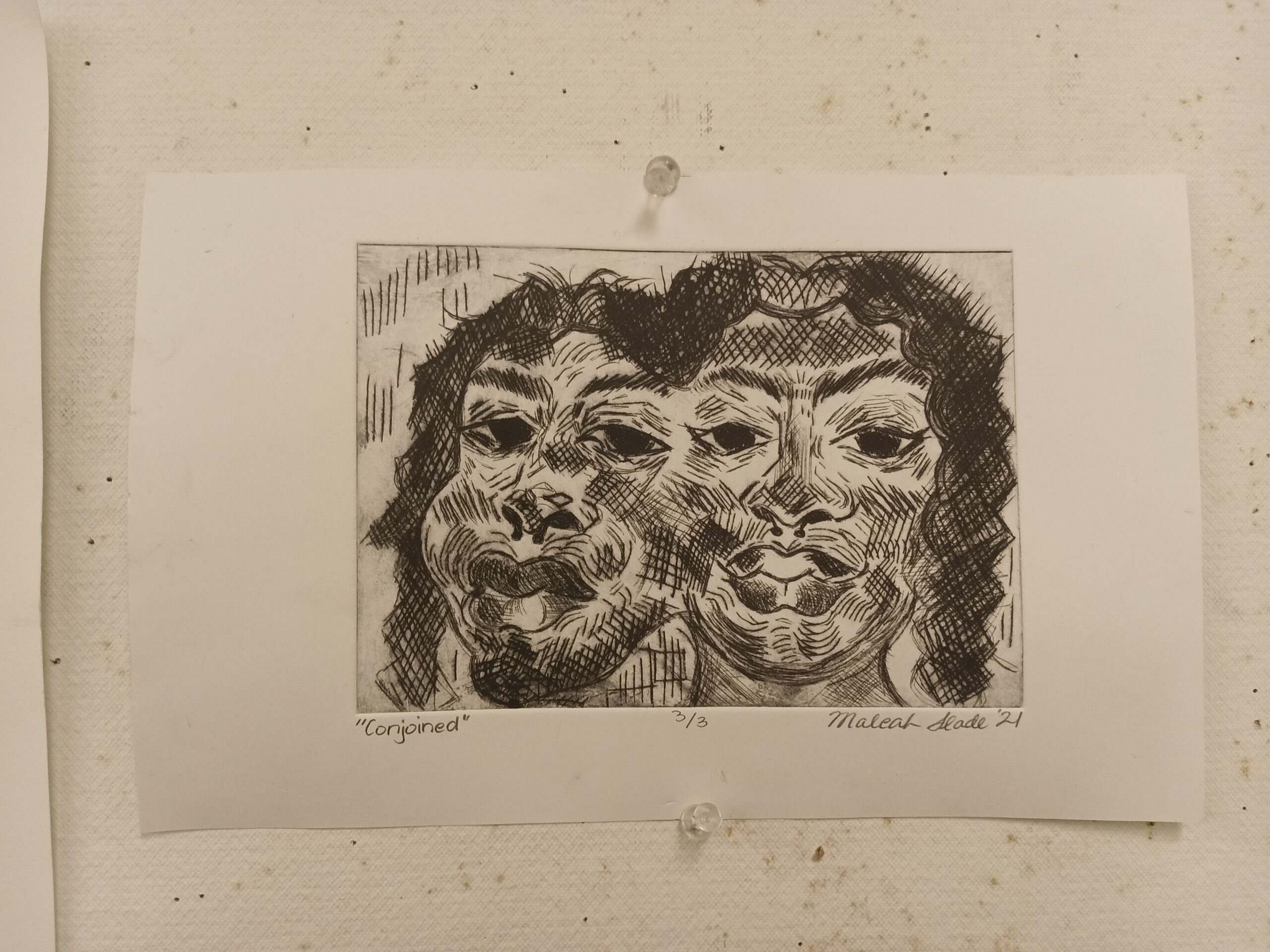
My first printmaking series consists of five prints in which all five prints were created using a subtractive/trace method. Five photographs of portraits were printed out; then the ink was rolled onto the plates — borders were made using tape — and newsprint was placed on top to eliminate any excess ink. The photographs were placed on top of the newsprint, traced on top of it, then removed with the newsprint, then more lines were scratched onto the plate using sharp pen tips and ink was subtracted from the plate using cotton q-tips to make the image more visible on the plate and on the paper.
The overall theme of this series revolves around masks and peeling skin. While making this I thought of how people present themselves one way in public but are another way in private; at the end of the day, the mask comes off.
This series is a new exploration of something that was born from older works made prior to taking this class. The photographs were taken last year in October and were meant to be saved for drawings, but the drawings fell flat and were saved to be used again another time.