Maleah Slade's Blog

WordPress site by Maleah Slade

Self-Portraits (Final Paintings)

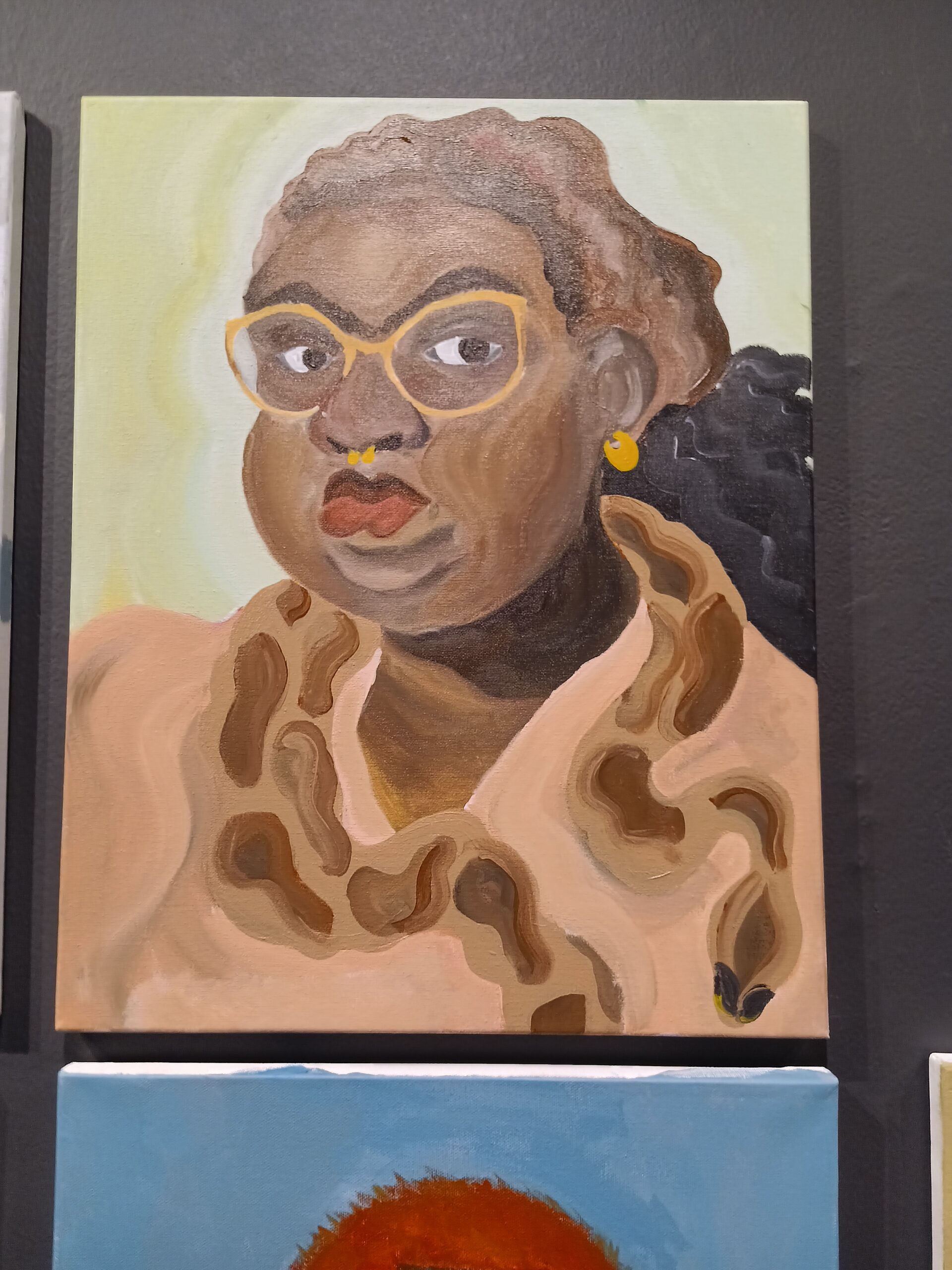
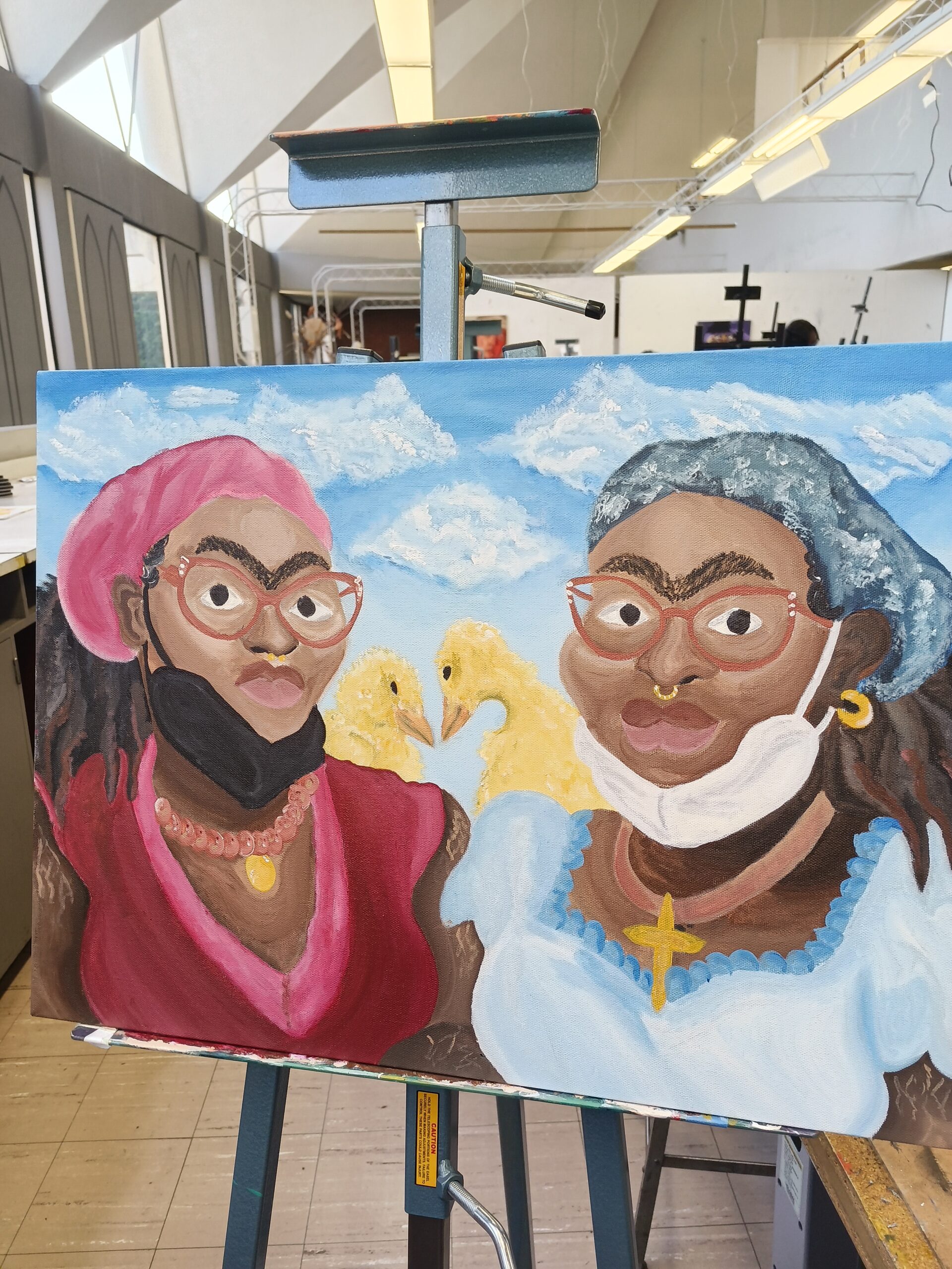
For my final paintings, I decided to make my self-portraits in the style of surrealist portraiture/still-life painter Frida Kahlo. I chose her style because I have always been fascinated with the realism of her portraits and the dream-like nature of her backgrounds. I wanted to focus on the aspects of her work that let people know that they’re viewing a work she created: the elongated neck, the tilted head with the forward facing eyes, the unibrow, and the nature-like background.

For both of my portraits, I lightly sketched out the idea in thin graphite, then painted it– starting with the background, then moving onto smaller and secondary subjects — the snake and the duck, then the skin and clothing and hair. As I was working on my paintings, I found myself blending warm and cool colors into my brown paint as often as possible, trying to get the correct shades of brown for my skin to show areas of highlight. This is my first time painting skin tones, and I wanted to incorporate my stretch marks, so this was an entirely new experience. I was also surprised at my ability to paint almost-realistic animals when I put in more work, as the ducks came out better than the snake.

If I could start over, I would redo my entire first portrait (left) to incorporate as much of the time and effort and do-overs that I put into the second portrait (right). When I was working on the first one, I found myself reverting back into using the same wavy brushstrokes on my skin that I used for my still-life painting, which made it look less realistic and less like Kahlo’s style.
Limited Color Painting

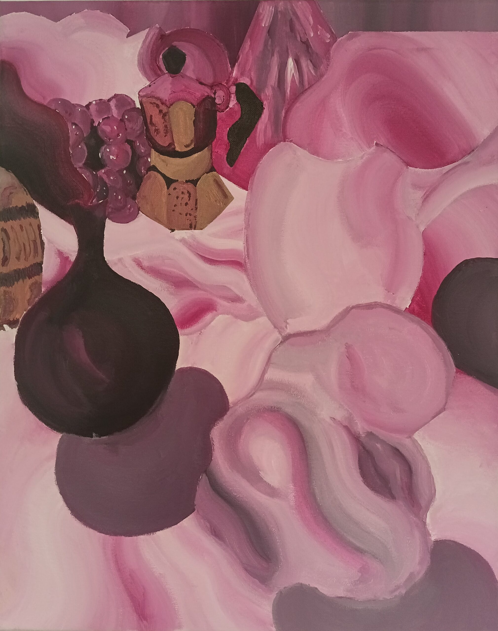
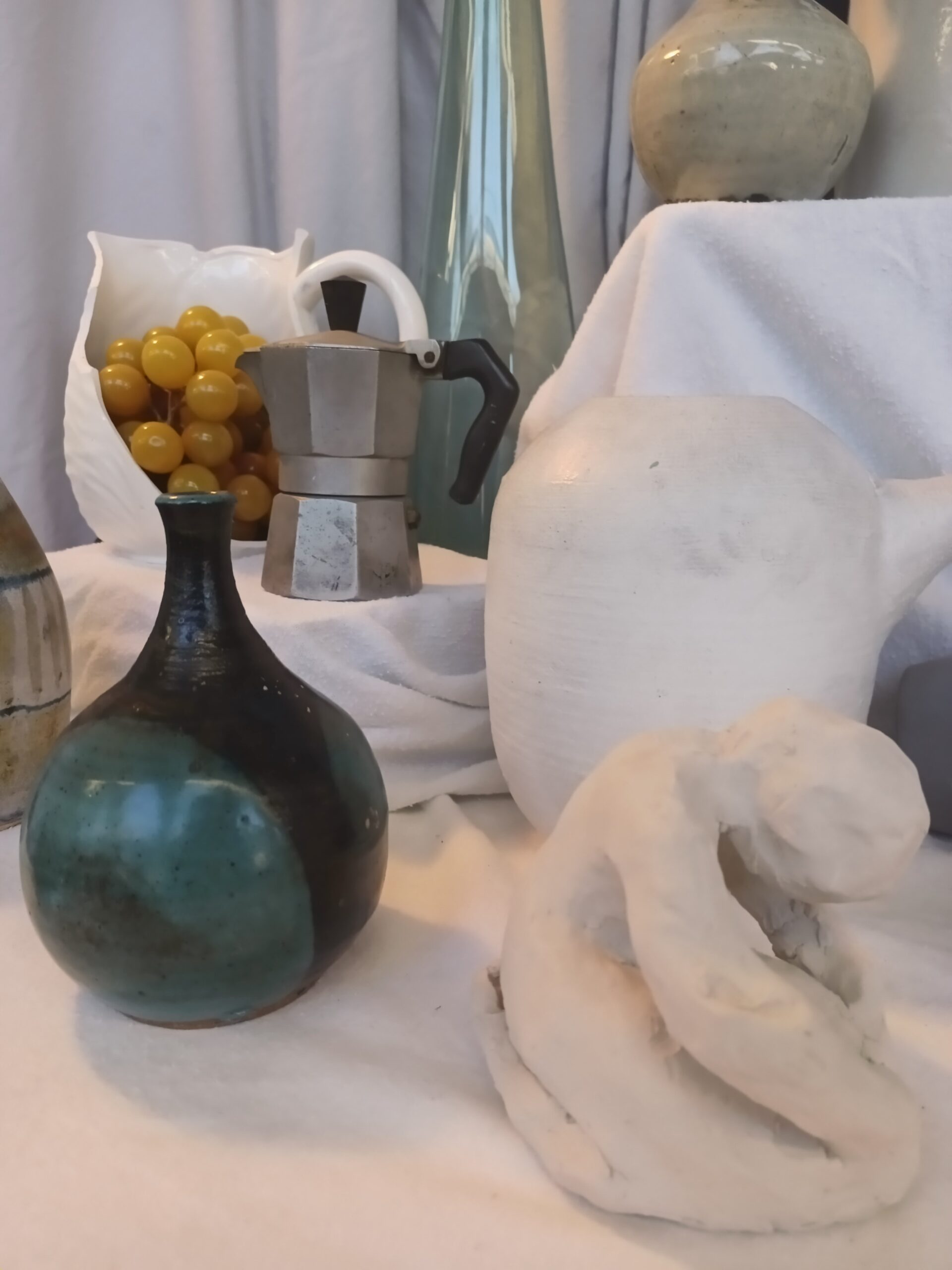
For the limited color painting assignment, I created a still-life painting. The limited color scheme is a monochromatic palette created using the Quinacridone Magenta acrylic paint from Liquitex — every tint, shade, and tone was the product of adding black, white, grey (and even brown) to Quinacridone Magenta. Every object was initially drawn out on the canvas using paint diluted with acrylic medium, then layers of paint without acrylic were added after. Larger objects such as the open vase with grapes and transparent bottle were painted first, then came objects in the middle and bottom.

This time around I attempted to learn from my prior mistake and focus on areas of light and dark/shadow, so I put in many layers and tried to be more fluid with my brush strokes. I think that this may have worked on a lot of areas and let the more interesting objects (such as the student sculpture of the person in the front) become focal points. I was also able to define edges on many of my objects. Next time around, I want to work on my brushstrokes to make my work feel more realistic and make the subject appear less flat.

Color Exercise

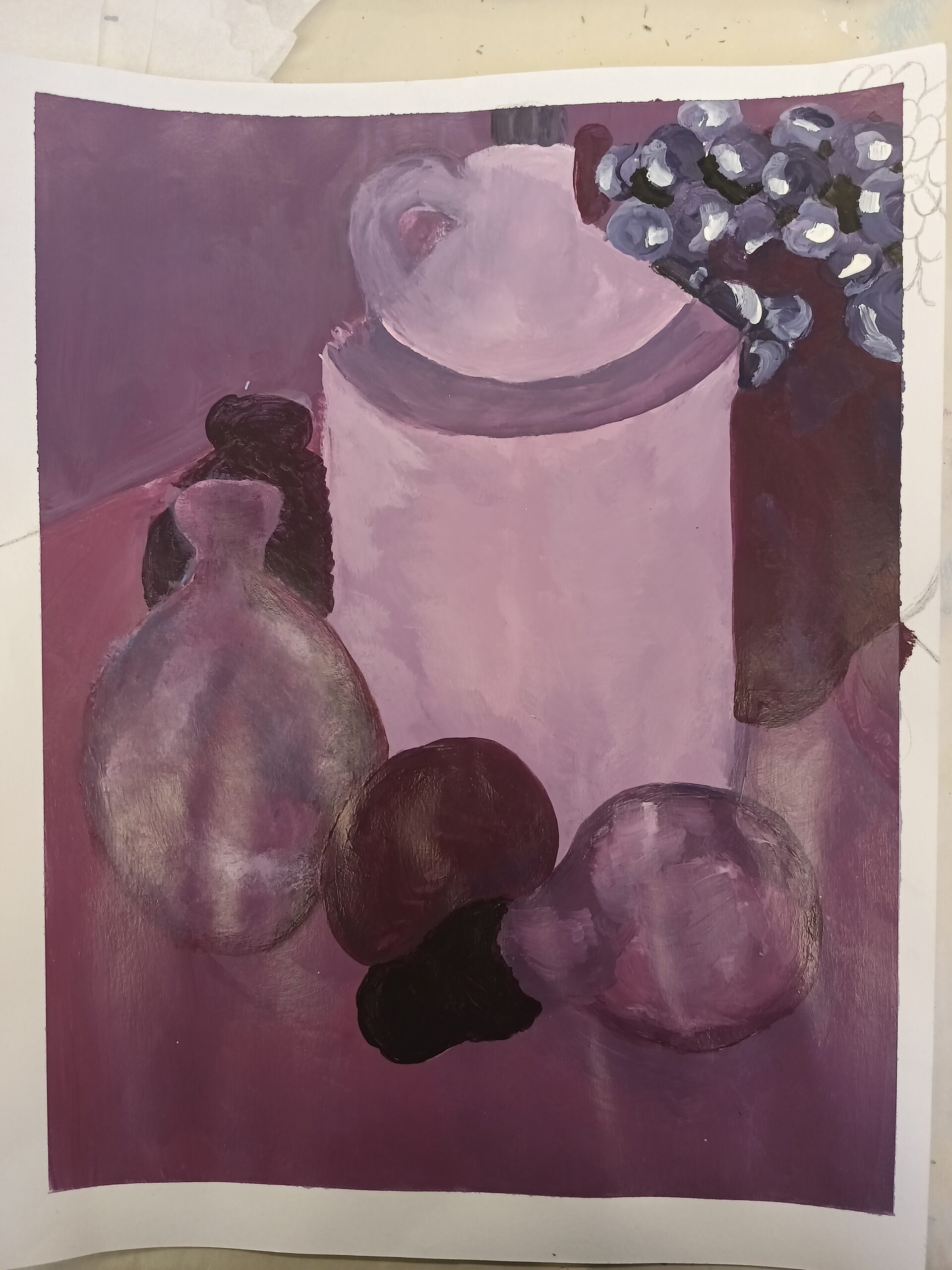
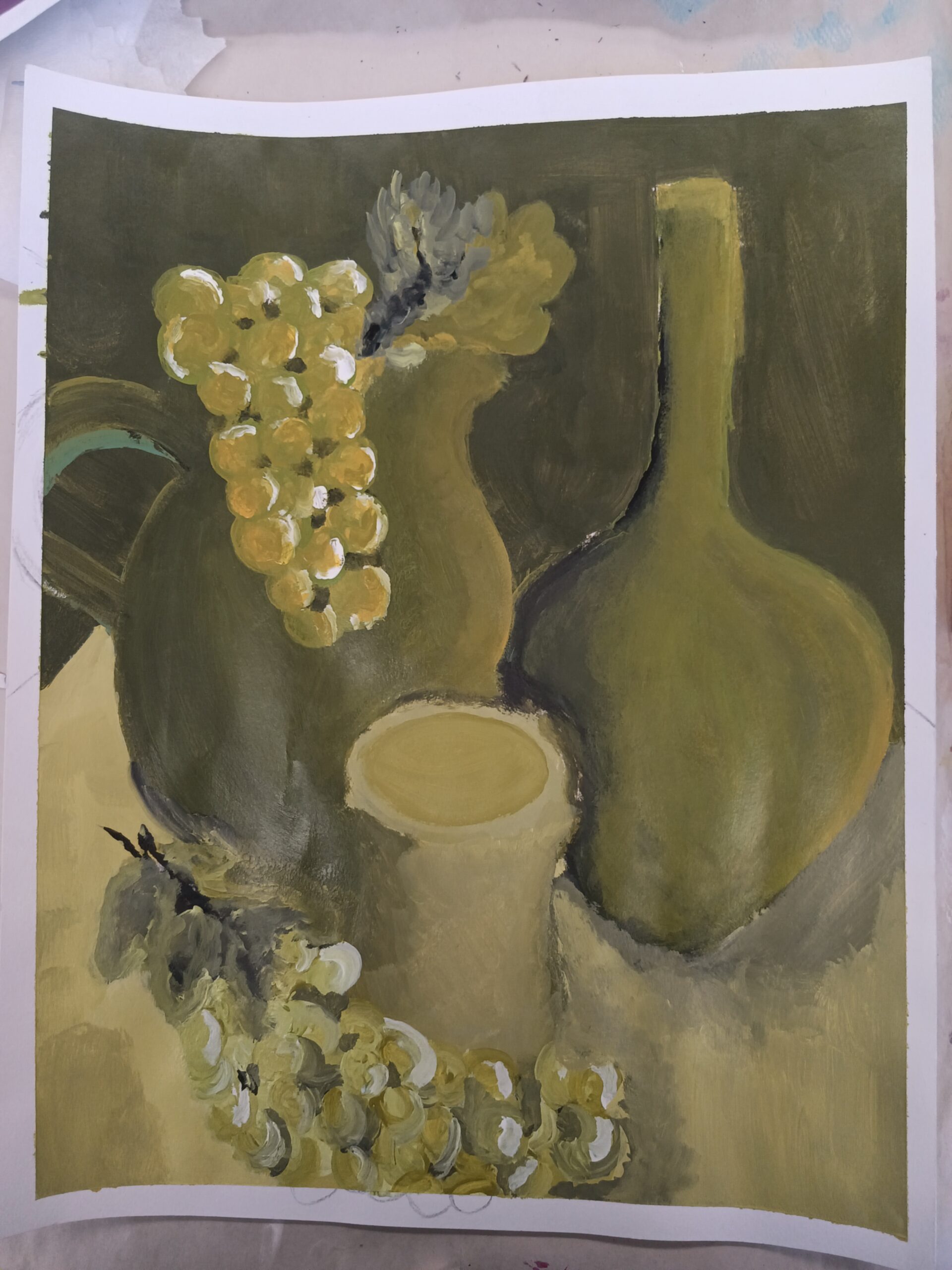
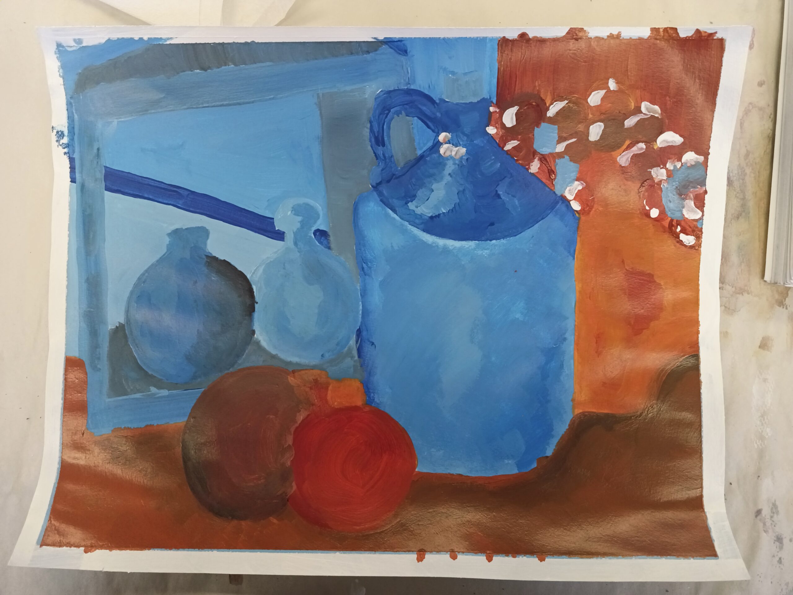
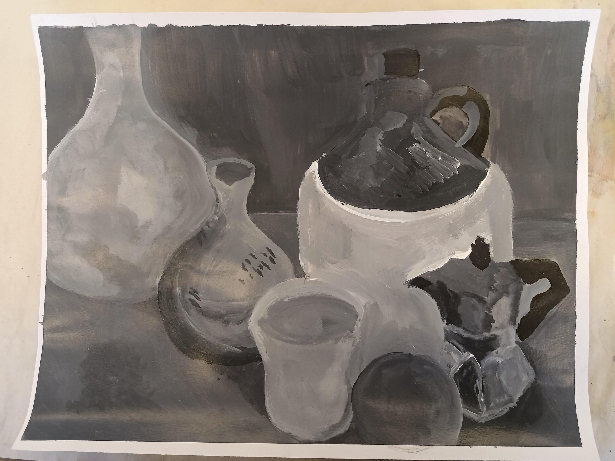
For the first color exercise, I created four paintings of still-life’s. Two of the paintings consist of a monochromatic color palette (purples and greens), while the third was made in complementary colors (blue and orange) and the fourth was done in neutrals/greyscale. For each painting, the objects chosen for the reference were often rearranged or swapped out for other objects.

I decided to outline the objects for each painting in soft graphite instead of acrylic paint before color blocking the background and objects. Then, as I went through each object, I applied more layers as I worked to create areas of value in and around each object. I should have paid more attention to where the light source was coming from in each object and blended more carefully to create a better range of tints and shades for each color. In the case of the complementary colors painting, I should have taken more care to create a white border using artist tape; however, when I first started color blocking I did not think to do so. In the monochromatic purple painting, something I need to improve on is establishing more defined edges for each object so that they don’t clash with the foreground.

Print Project #1 – Monoprint

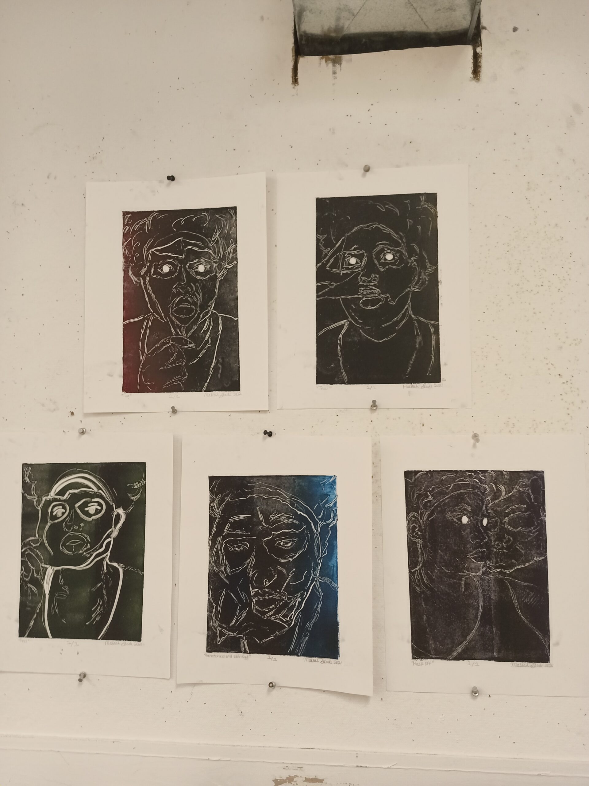
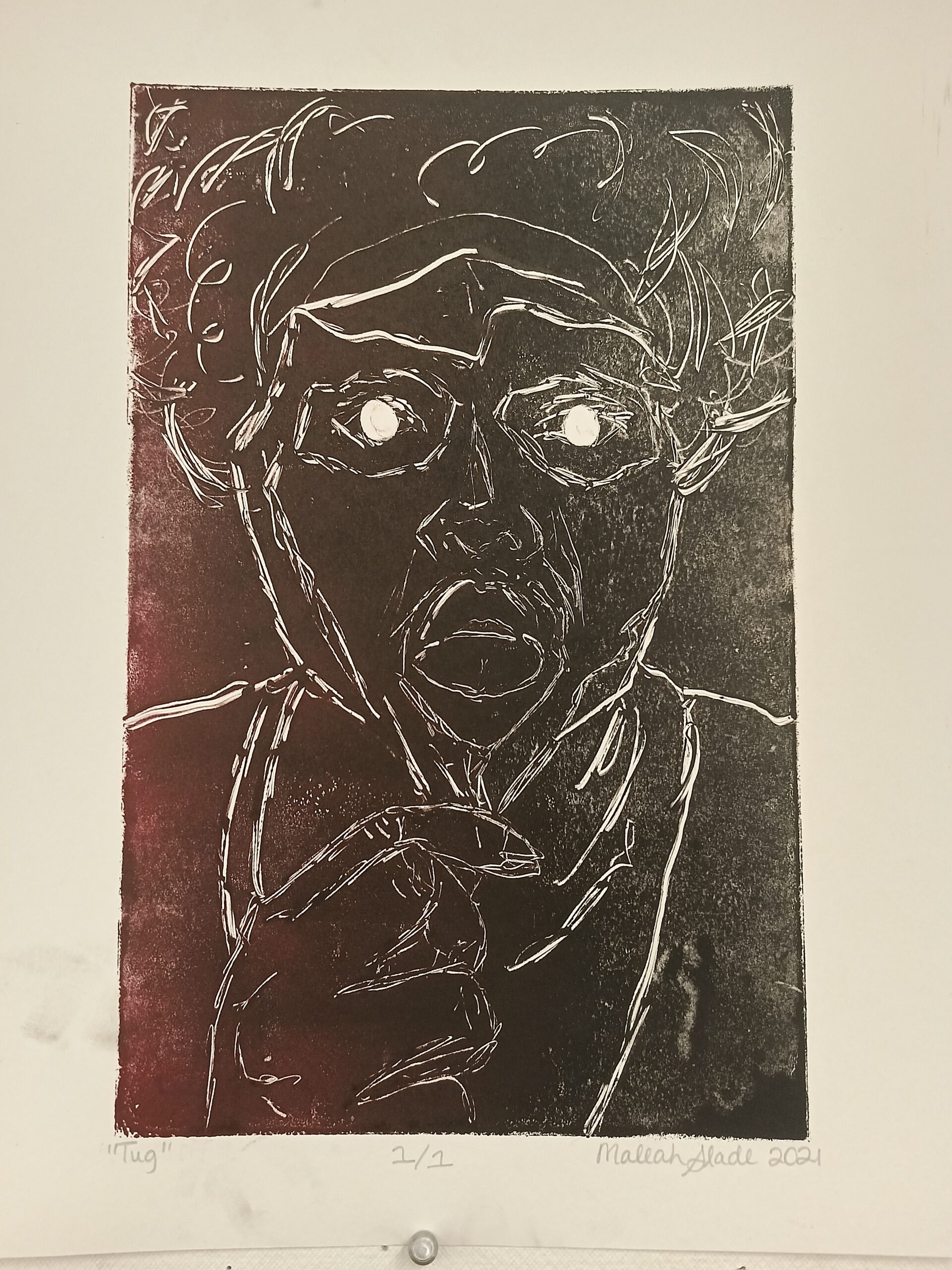
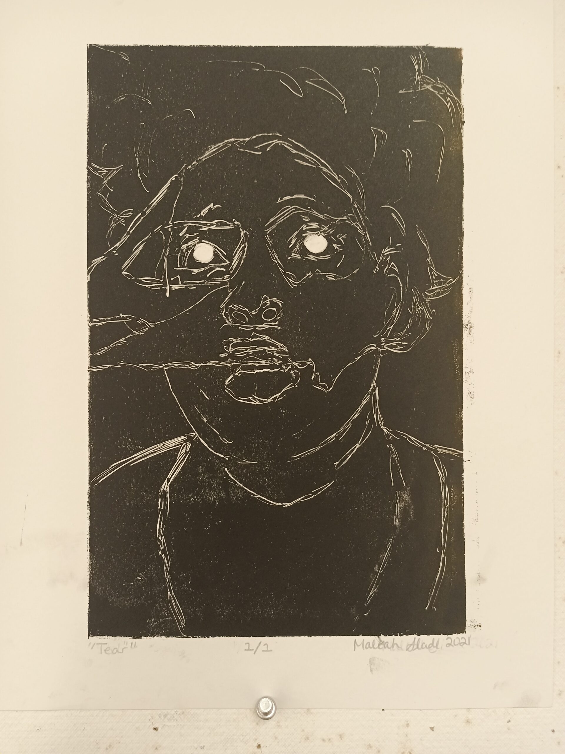
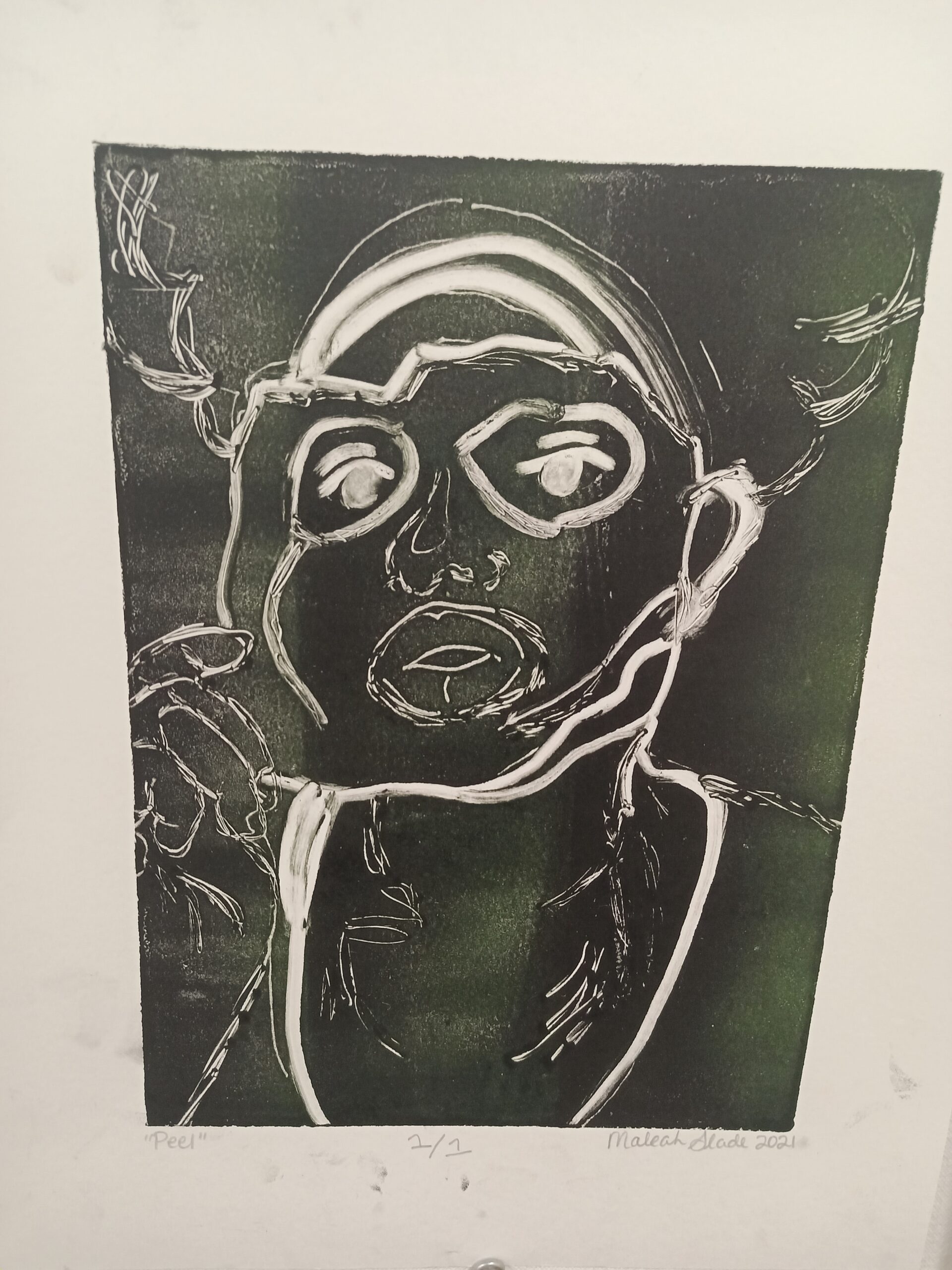
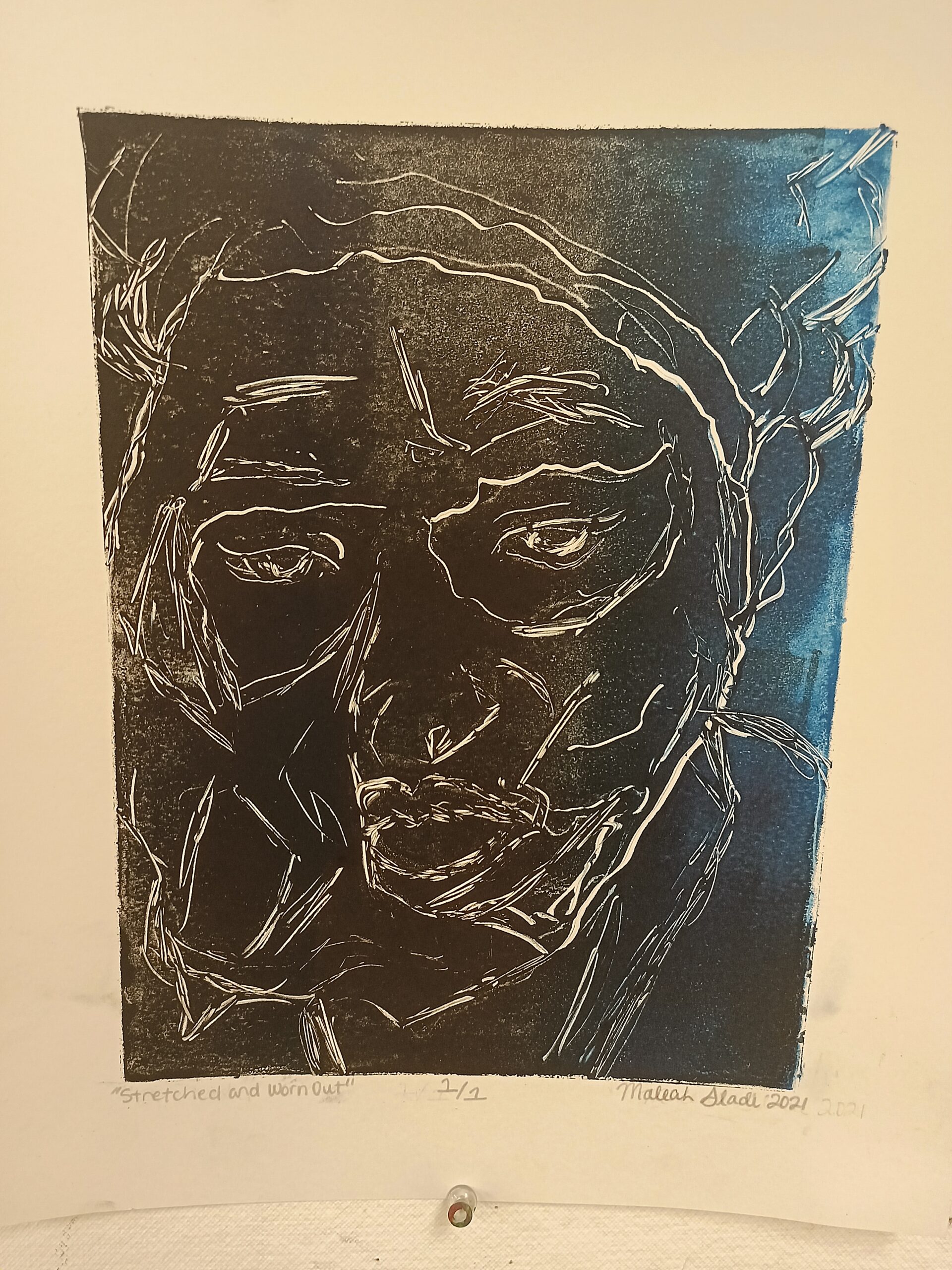
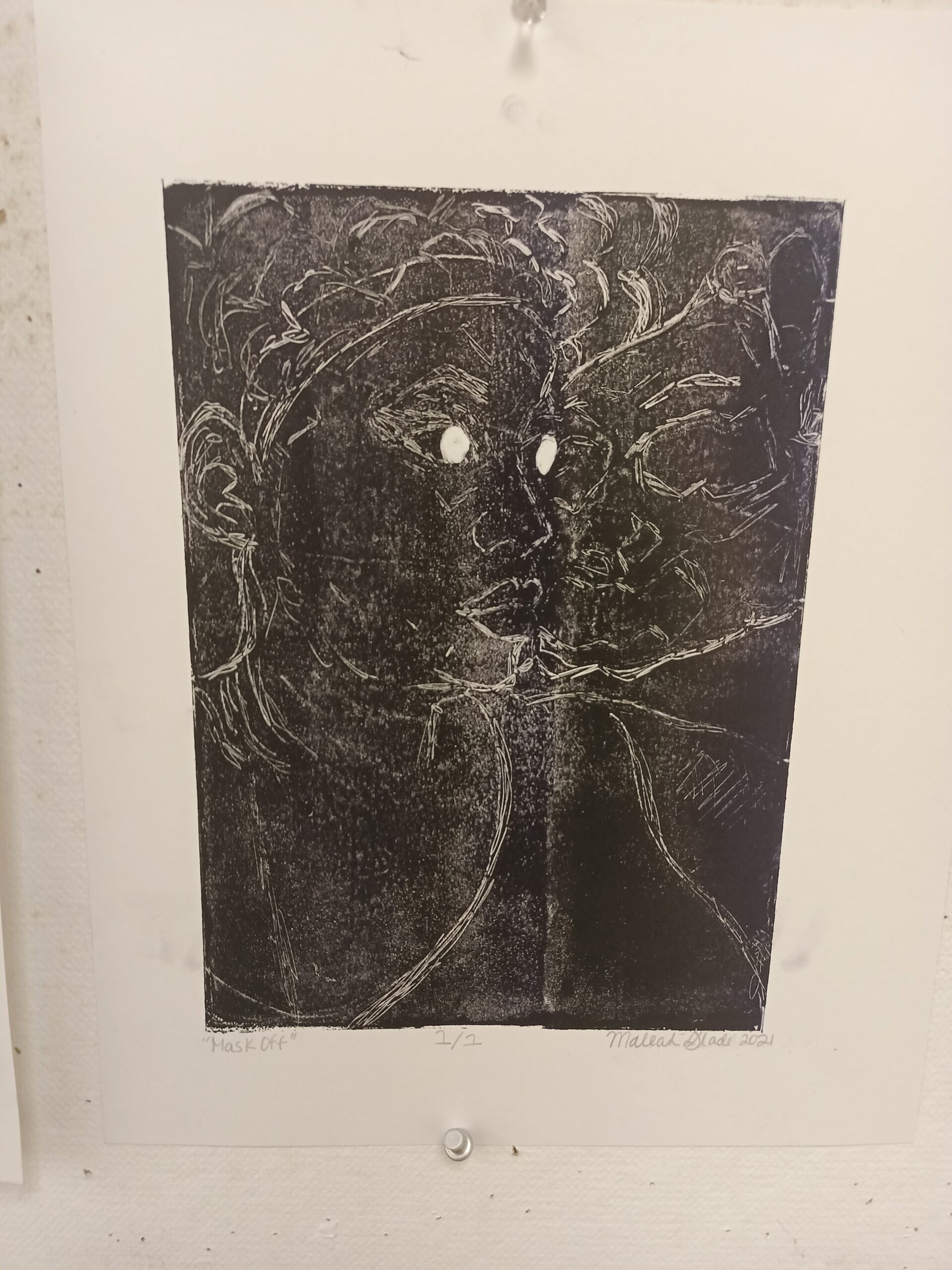
My first printmaking series consists of five prints in which all five prints were created using a subtractive/trace method. Five photographs of portraits were printed out; then the ink was rolled onto the plates — borders were made using tape — and newsprint was placed on top to eliminate any excess ink. The photographs were placed on top of the newsprint, traced on top of it, then removed with the newsprint, then more lines were scratched onto the plate using sharp pen tips and ink was subtracted from the plate using cotton q-tips to make the image more visible on the plate and on the paper.

The overall theme of this series revolves around masks and peeling skin. While making this I thought of how people present themselves one way in public but are another way in private; at the end of the day, the mask comes off. 

This series is a new exploration of something that was born from older works made prior to taking this class. The photographs were taken last year in October and were meant to be saved for drawings, but the drawings fell flat and were saved to be used again another time.

Print Project #4 – Final Prints (Linoleum Relief)

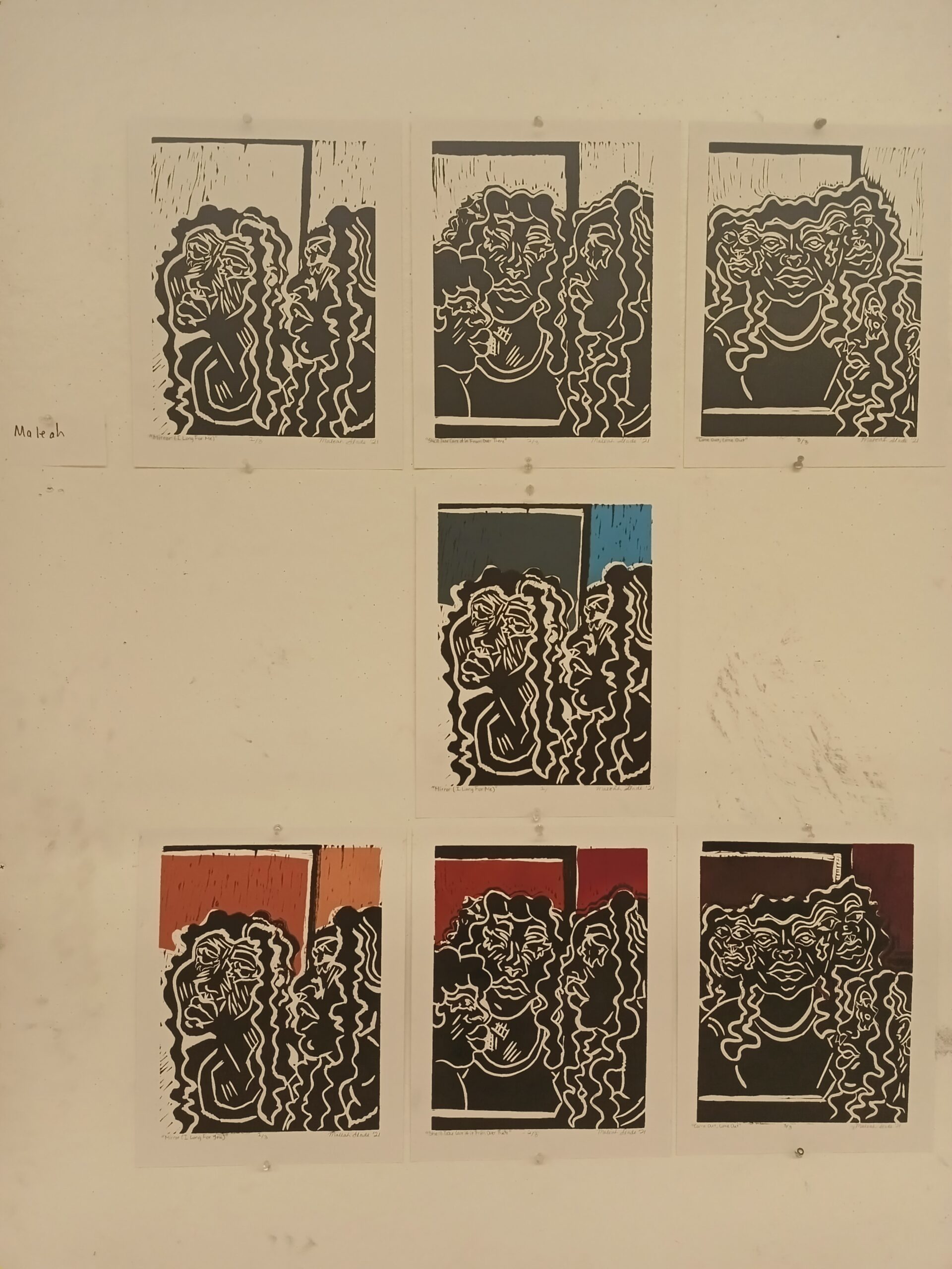
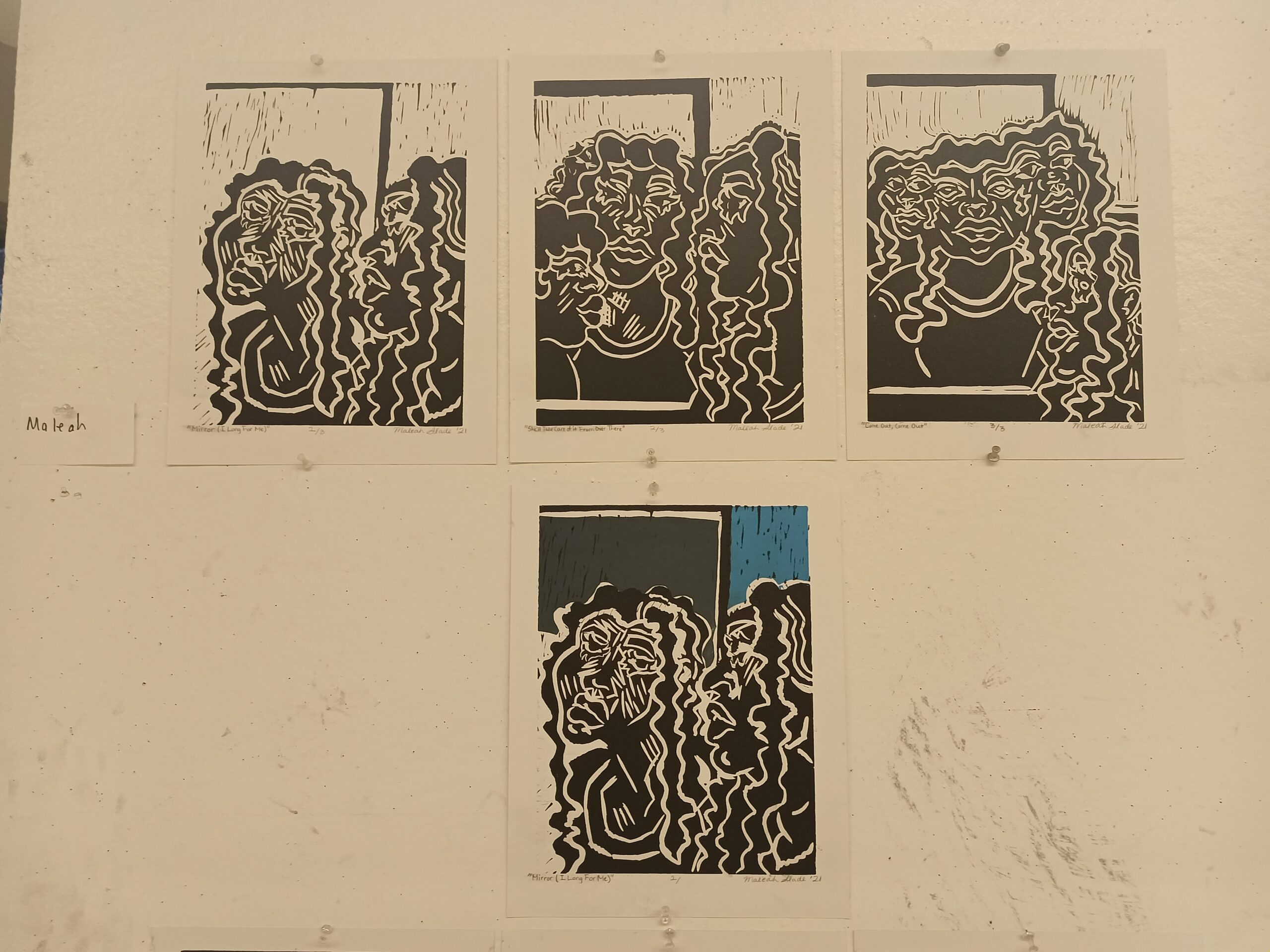
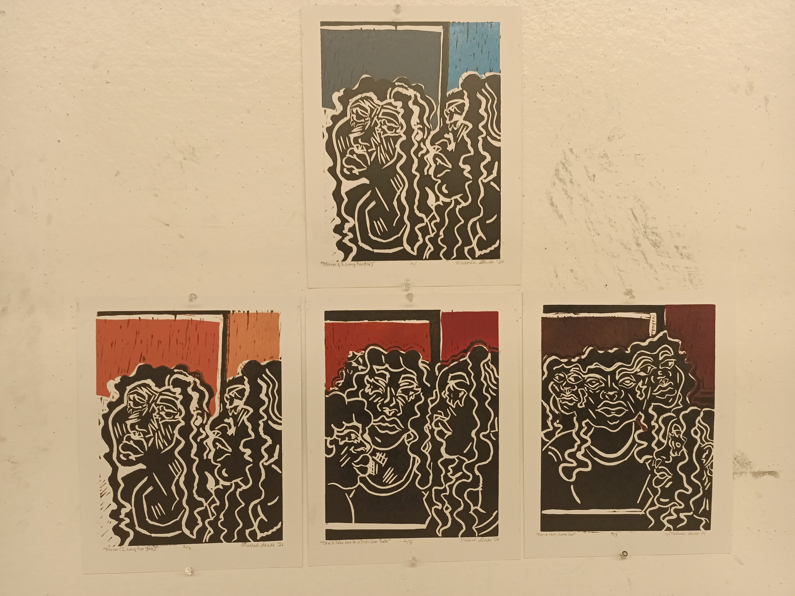
My final prints for the semester are a series of black-and-white prints and a series in color — the latter of which is made from two blocks while the former is made of only one. The series in color uses varying colors in the background that get darker to represent the damage being done during and after the relationship. Both series follow the same narrative: an individual looking into a mirror at their reflection notices how their reflection is no longer mirroring them; a strange woman has appeared in the mirror’s reflection and is leaving marks on the reflection’s neck, causing a second head to emerge. In the end, a total of three heads merged onto one body are visible in the mirror and coming out of it in the final print.

The series refers to former work that I have done in this class — the merged heads (from the “Conjoined” drypoint etchings) and the woman leaving the marks (from the “Love is (Not) Black & White” relief edition) both make a reappearance. The series was meant to be a depiction of looking on at a relationship that extends beyond traditional standards and boundaries: two individuals exist and love in secret, and the heads’ emergence from beyond the mirror world represents a form of coming out. On the contrary, I also viewed this as looking on at a codependent relationship: as the individual in the real world acknowledges how the unhealthy attachment to their partner has now led to the emergence of unhealthy behaviors — or in this case, multiple heads. Either way one has to ask: is the change, in the end, one for the worse or the better?

Print Project #3 – Etching (Drypoint Method)

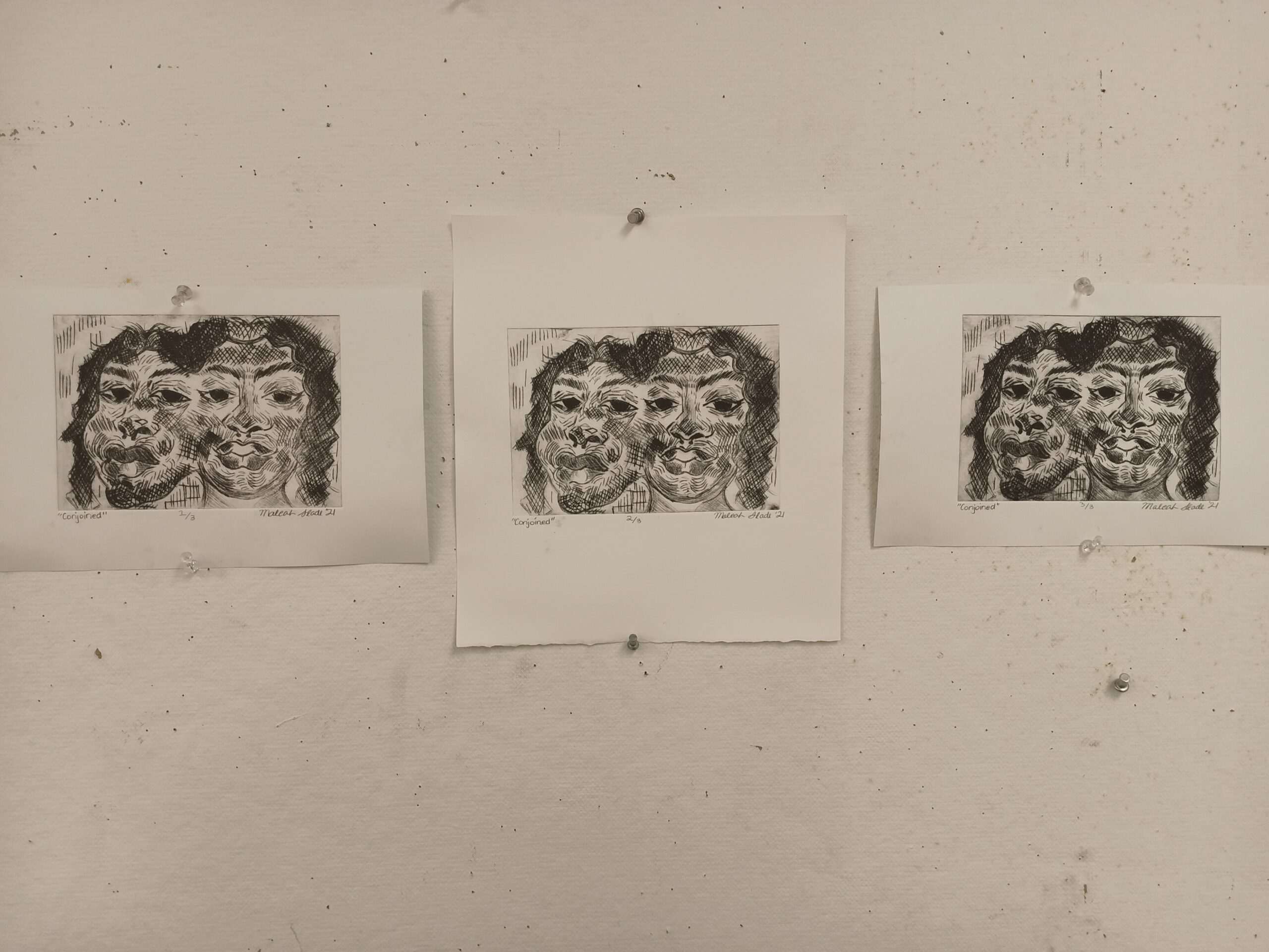
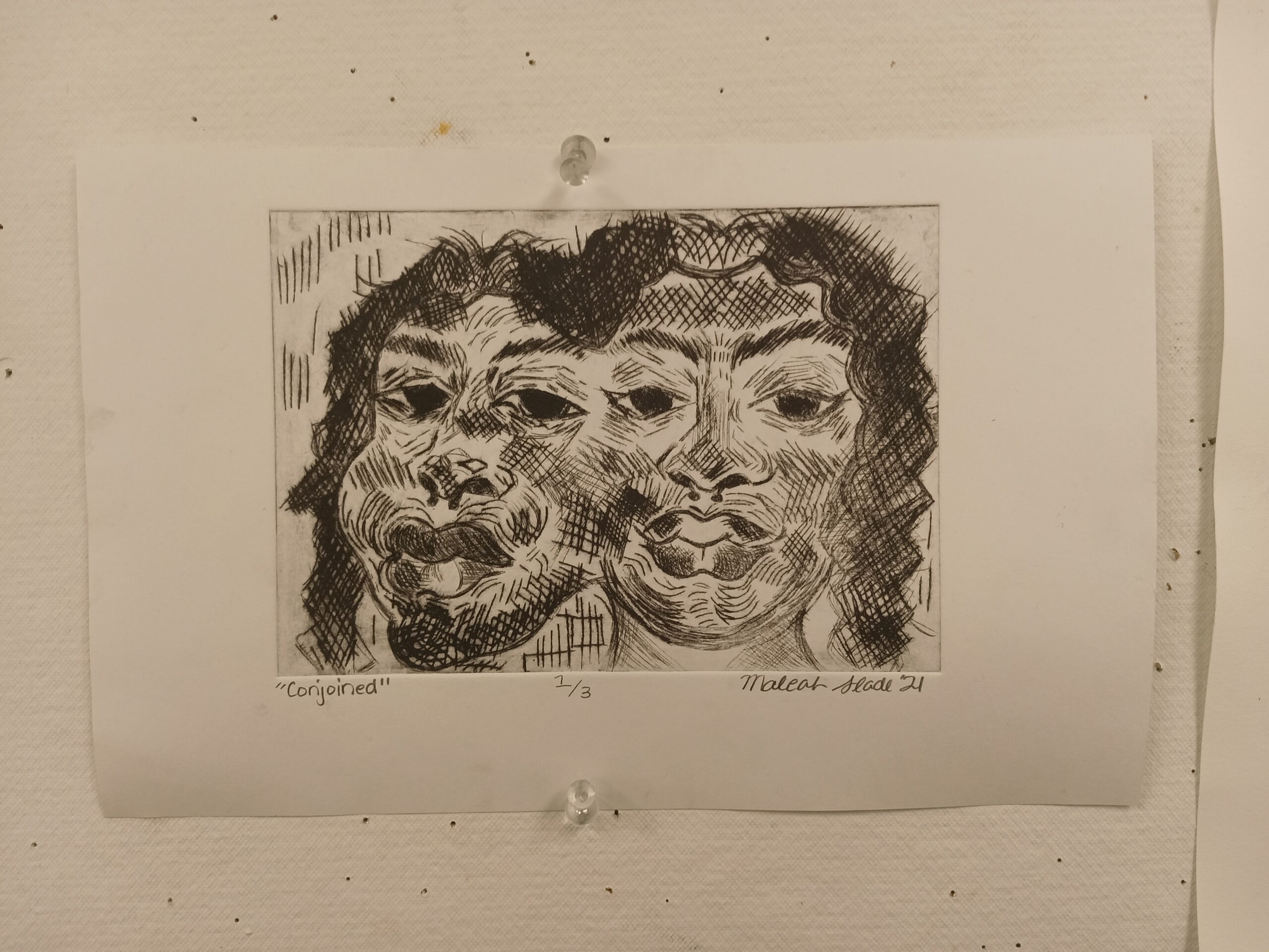
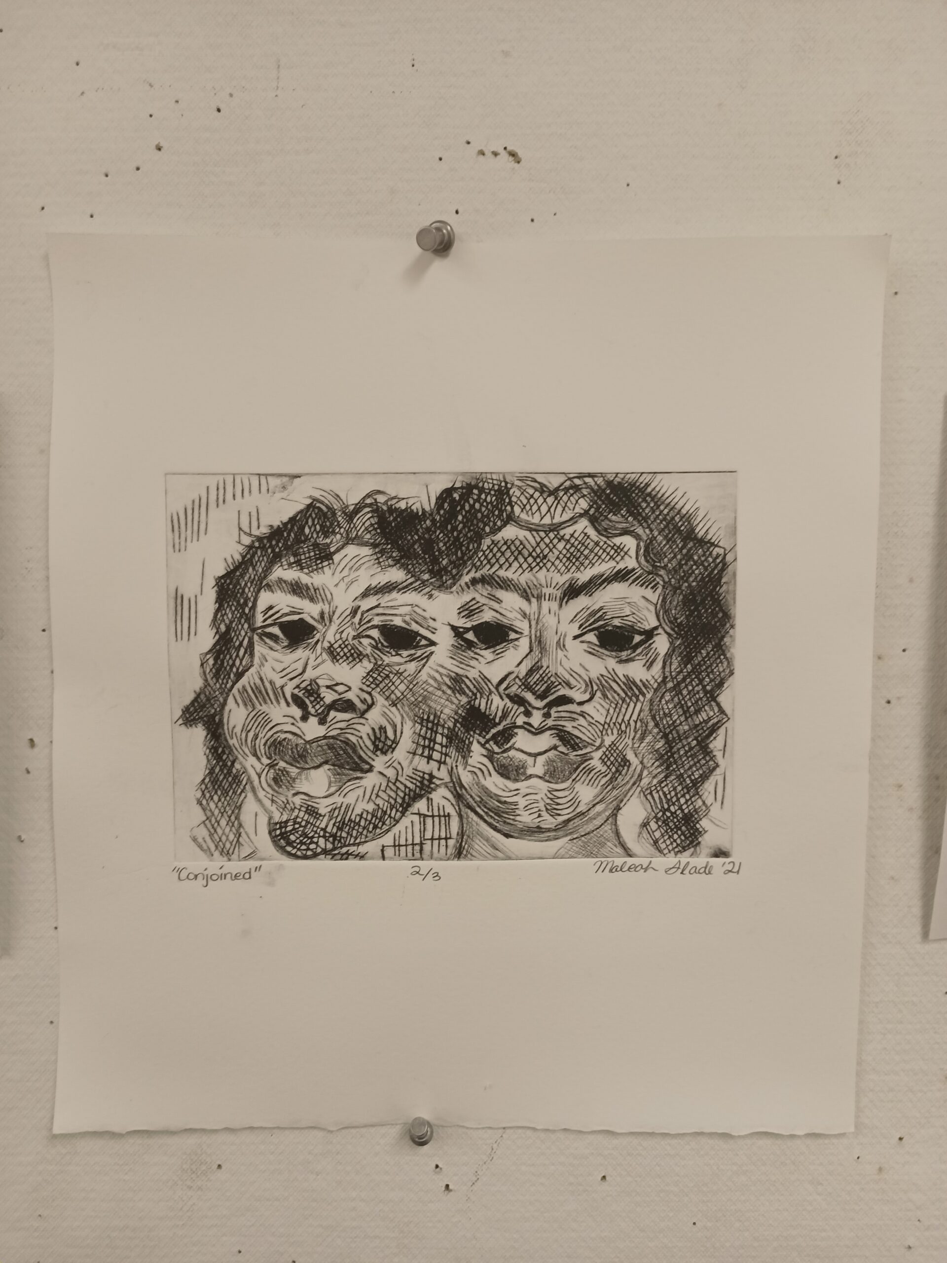
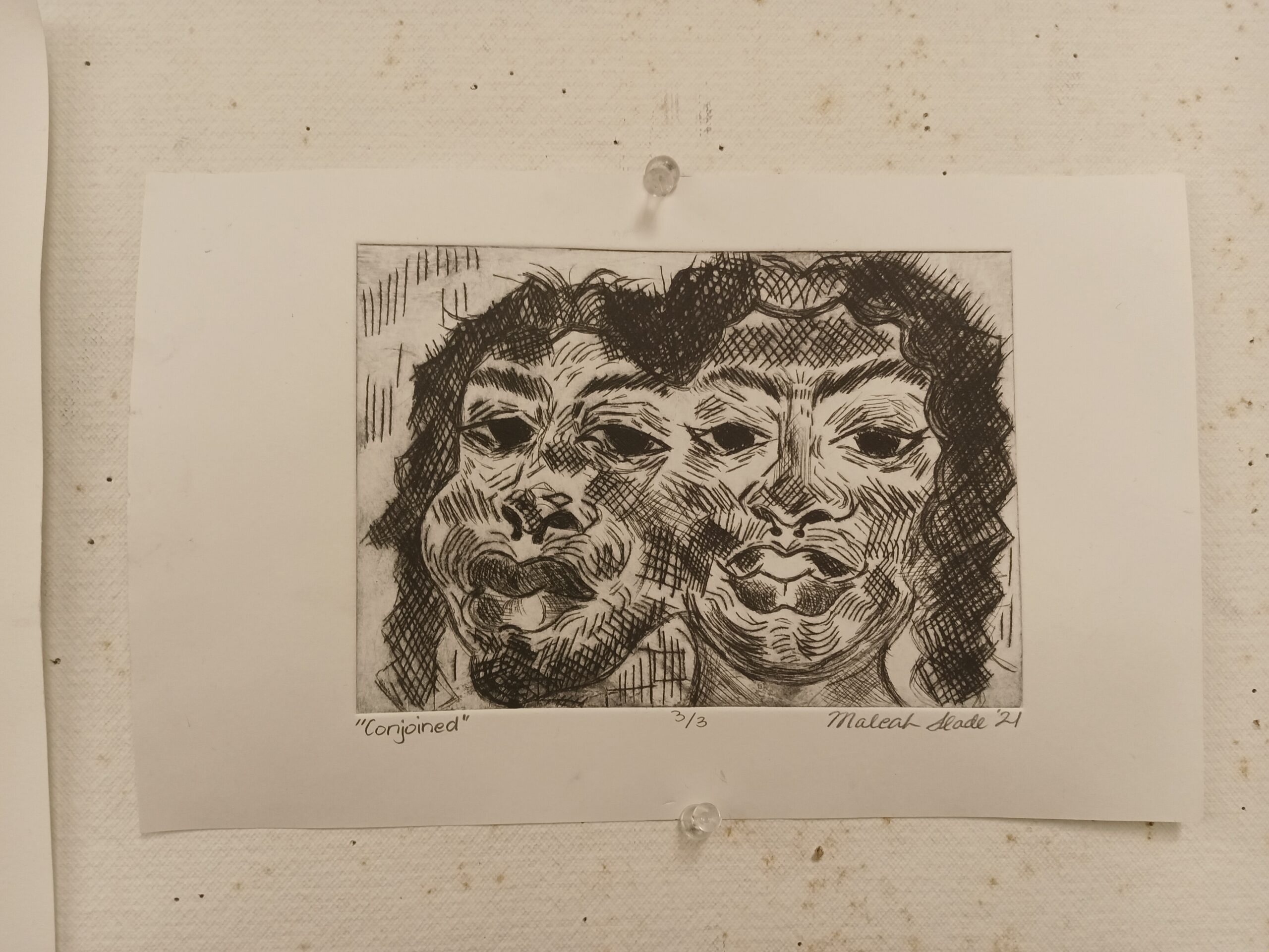
This edition of etchings is meant to experiment with a new concept I’ve always wanted to try out (merged heads) as well as with cross-hatching. I took two photographs of myself and drew the heads together, conjoined at their sides, then etched the image onto the plate.

This edition is almost a tribute to my twin sister — while we are fraternal, we have often been confused for each other — but it is also meant to remind me and the viewers of what it physically looks like to experience intrusive thoughts/having multiple voices in our head/”being beside yourself”.

Print Project #2 – Relief (Linoleum)

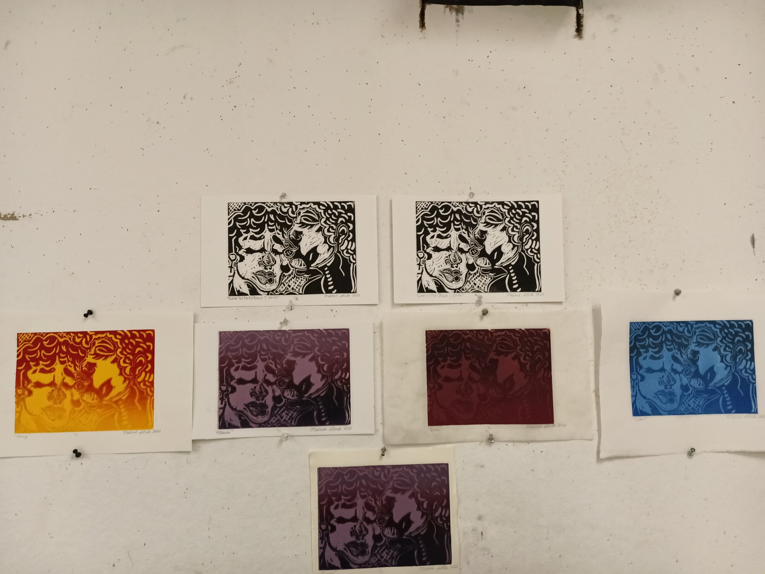
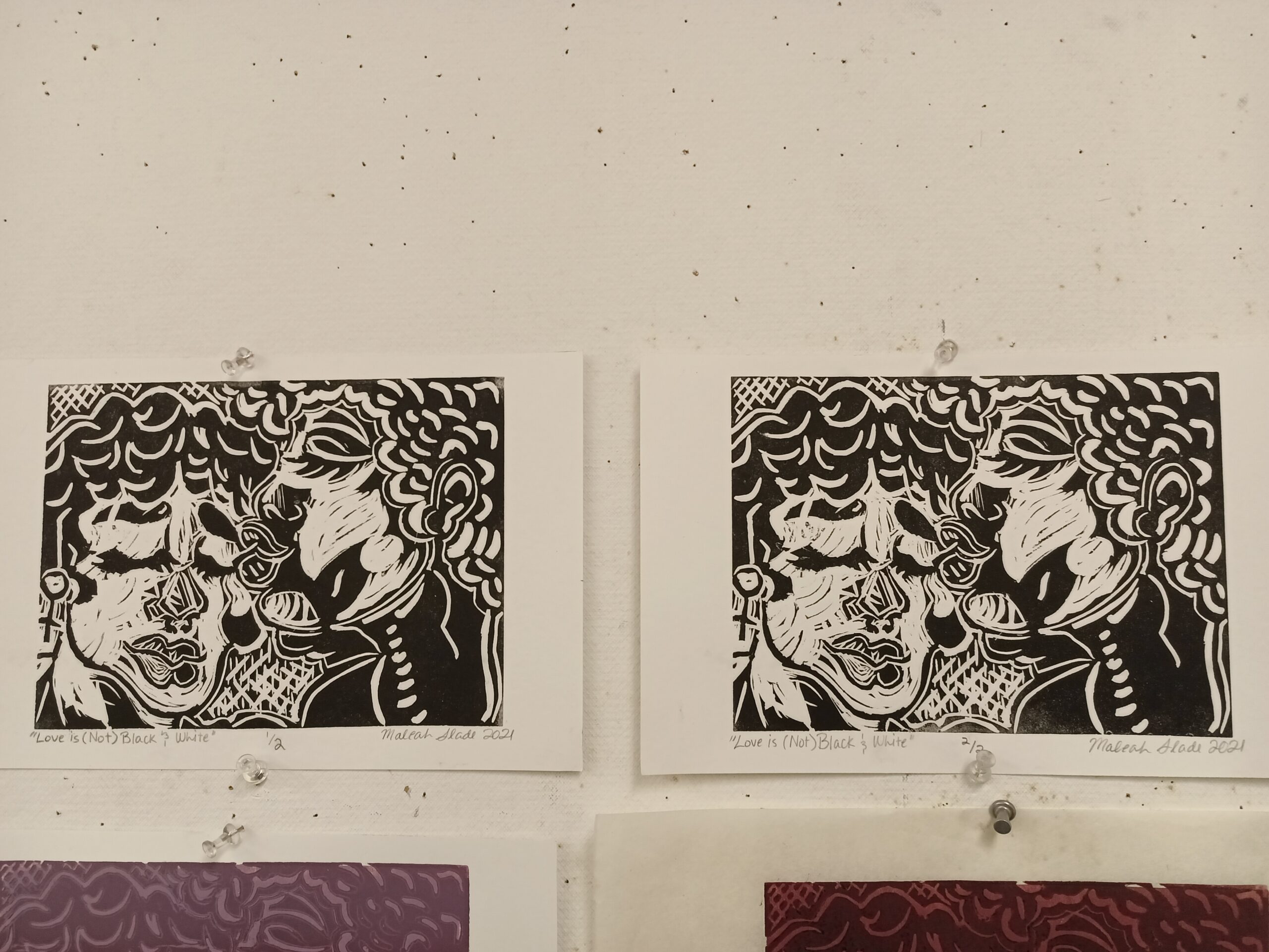
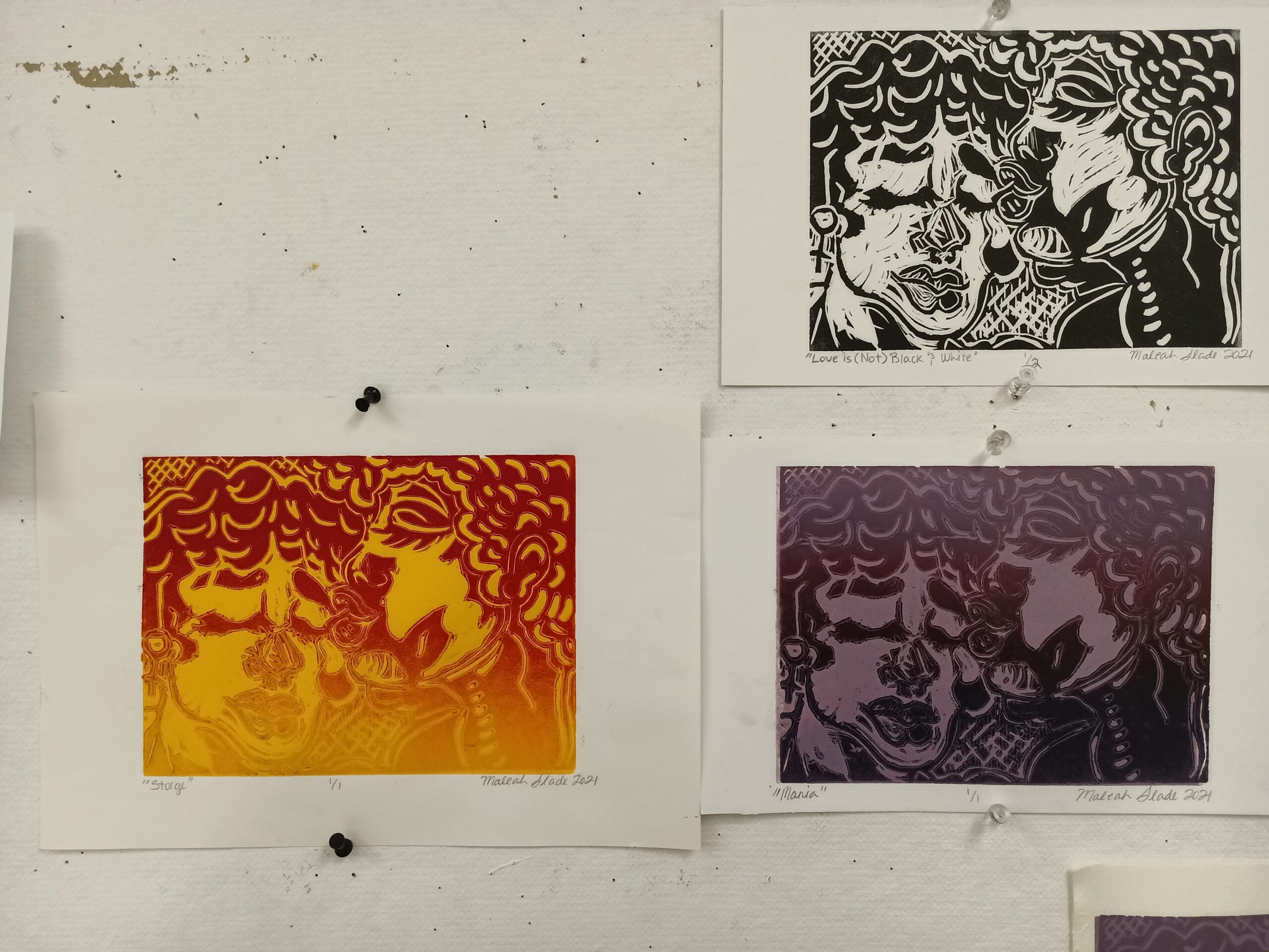
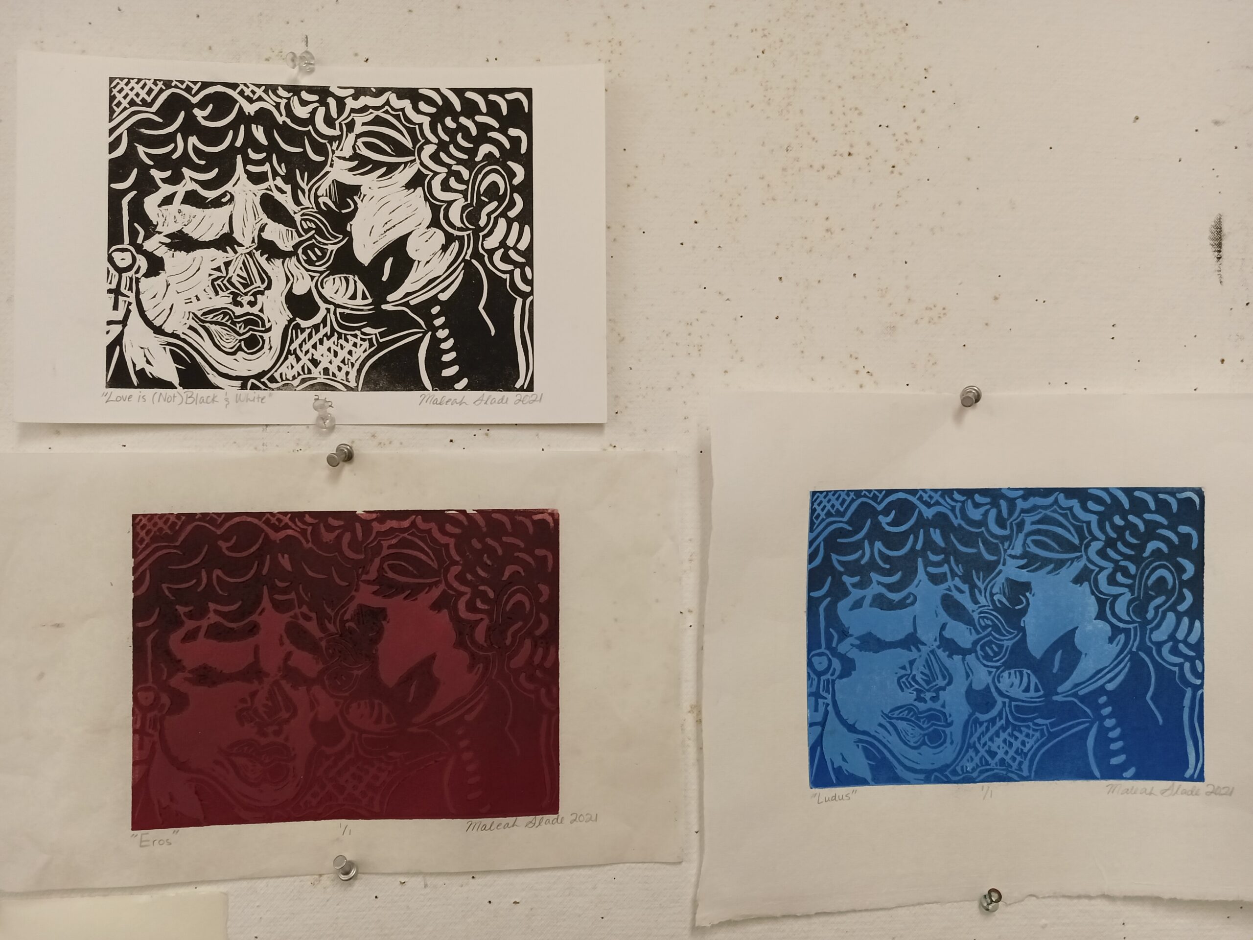
The prints created in this project consist of an edition in black and white and a series in color. For the series, one-color flats were printed first and a gradient roll of similar colors were printed afterwards with the image on top of the flat. Using John Alan Lee’s color wheel theory of love, the colors used in the flats and gradients in each print represent four different types of love in Lee’s color wheel  — ludus (playful; game-like love; blue), mania (obsessive love; violet), eros (passionate, physical love; red), and storge (familial/brotherly love; yellow). 

This series of relief prints takes an older project of mine and puts a new spin on it. Originally an idea made in black and white a year ago, the colors used today are used to illustrate the different relationships of the couple embracing each other in the prints — I can not give you one idea as to who these individuals are and what their story is because I interpret them in many different ways. While some may view them as something simple like mother and daughter or a pair of sisters (storge), others may see lovers (eros). They could also be friends with privileges (ludus), or perhaps they are obsessive lovers enjoying physical contact (mania).

Final Drawings

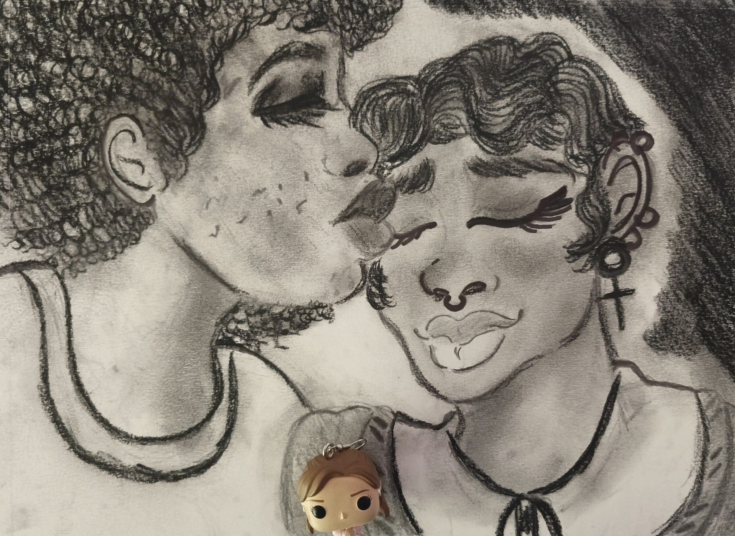
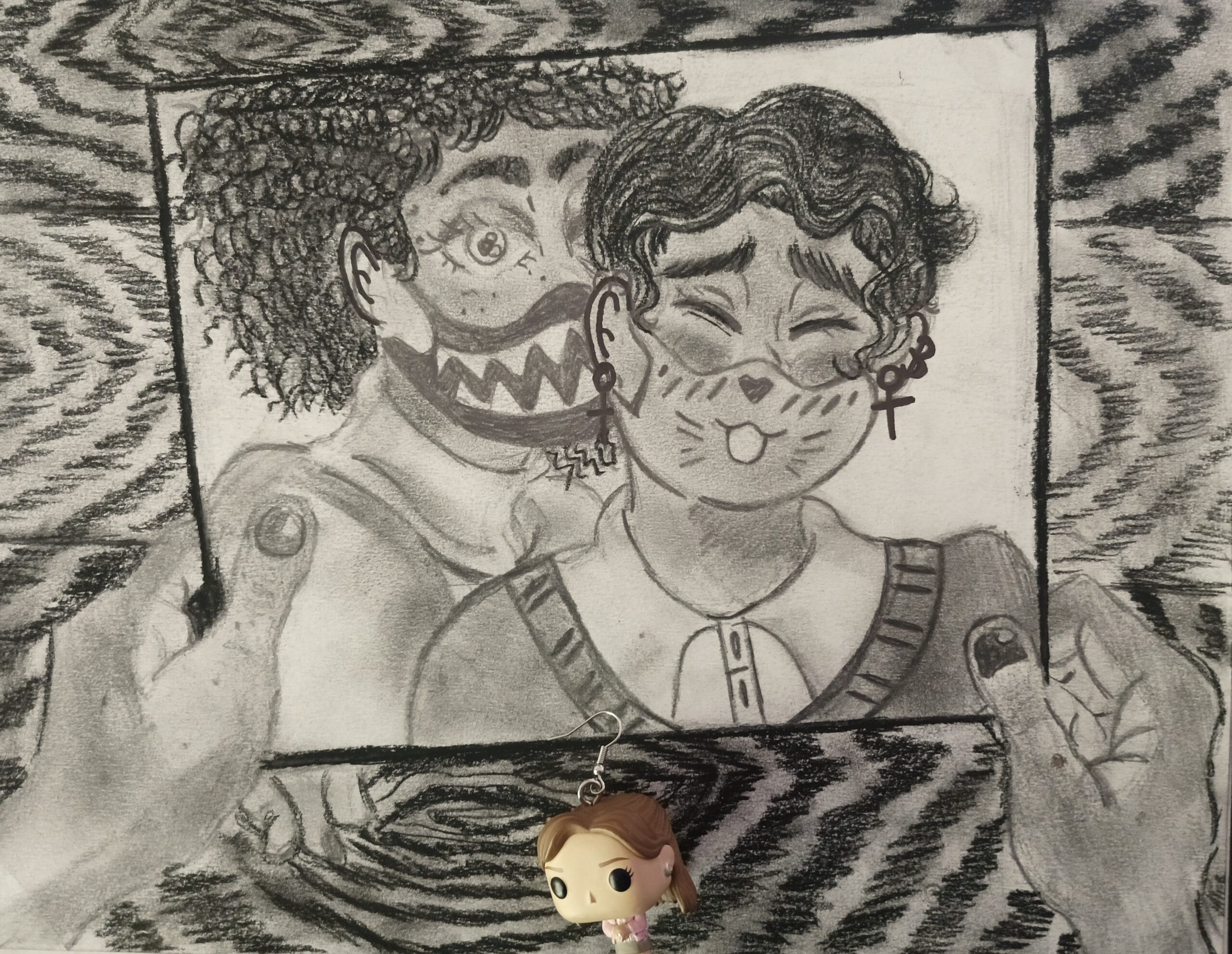
For my final two drawings, I chose to focus on the prompt of narrative. The narrative I selected surrounded lovers in quarantine and feelings surrounding separation — as lots of people in love had to keep away from each other when the COVID-19 lockdown began. For the first drawing, I drew two black/African-American individuals in a romantic embrace in which one is kissing the other. This represented the time prior to the lockdown in which people roamed freely and were able to hold one another without fear of passing on the virus. For the second drawing, I drew two hands holding a picture of the same two people, but in the photo they were wearing masks. This was made to represent the time during the pandemic when areas began releasing mask mandates and lockdowns/periods of quarantine. For both works, I used a 6B and 8B graphite pencil as well as a black conte crayon.

For the second drawing, I chose to use a lot of lines in the background — to create a similar texture/pattern to that of a wood surface — after seeing how empty it was behind the photograph. I found myself going back and forth between both drawings to adjust the skin tones of the two individuals to make sure the values were the same.  

Something that was a challenge for me was texture — prior to this assignment I had never really drawn curly hair before and I had no idea how to. I wanted to signify that the two figures were African American not only through skin tone/value, but also through their hair (pattern/texture). I had to pull up more reference photos to figure out how to give the illusion of curls and coils. Additionally, I struggled with perspective — how could I demonstrate in the second drawing that the two individuals from the first were still seeing each other? The first idea was to have one on a laptop calling the other person, but I was displeased with it and decided not to go with it.

Most of my marks in both of the drawings are intentional — this includes the curls and coils of the hair. I didn’t have many problems with craftsmanship — I made sure of that by using lighter mediums this time around — but I did incorporate some marks into the drawing. For example, the dark color of the wooden surface in the second drawing was caused by accidental smudging of the black conte. Originally, I didn’t mean to smudge or blend the conte into the background, but after seeing how there weren’t a lot of dark areas, I decided to roll with it and keep on going.

I spent approximately 3 days in the brainstorming phase (brainstorming was due on the 21st but I needed an extra day to think some more). After the 22nd of April, I took an hour and a half each day (from the 23rd to 26th) in the planning phase. I ended up with a portion of the second drawing by the 26th that I was hesitant to post because I didn’t like how silly/cartoonish it looked — I wanted the body to look more semi-realistic. I ended up posting it, but later I scrapped it and started over with the photograph idea for the second drawing. After that, I took about two to three hours each day working on each drawing, constantly going back and forth to make sure the individuals looked the same. After settling on a skin tone, I struggled with deciding on other mediums because I didn’t want to mess up on what I already had. I decided that if I went too dark — compressed charcoal or vine charcoal — then I’d most likely ruin the work, so I settled on the conte stick for the curly hair.

Expressive Self Portrait

General description-what did you draw and what materials did you use?

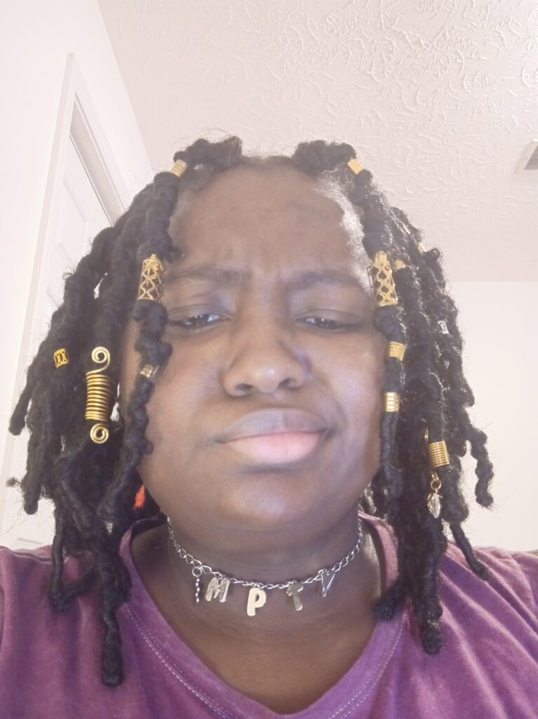
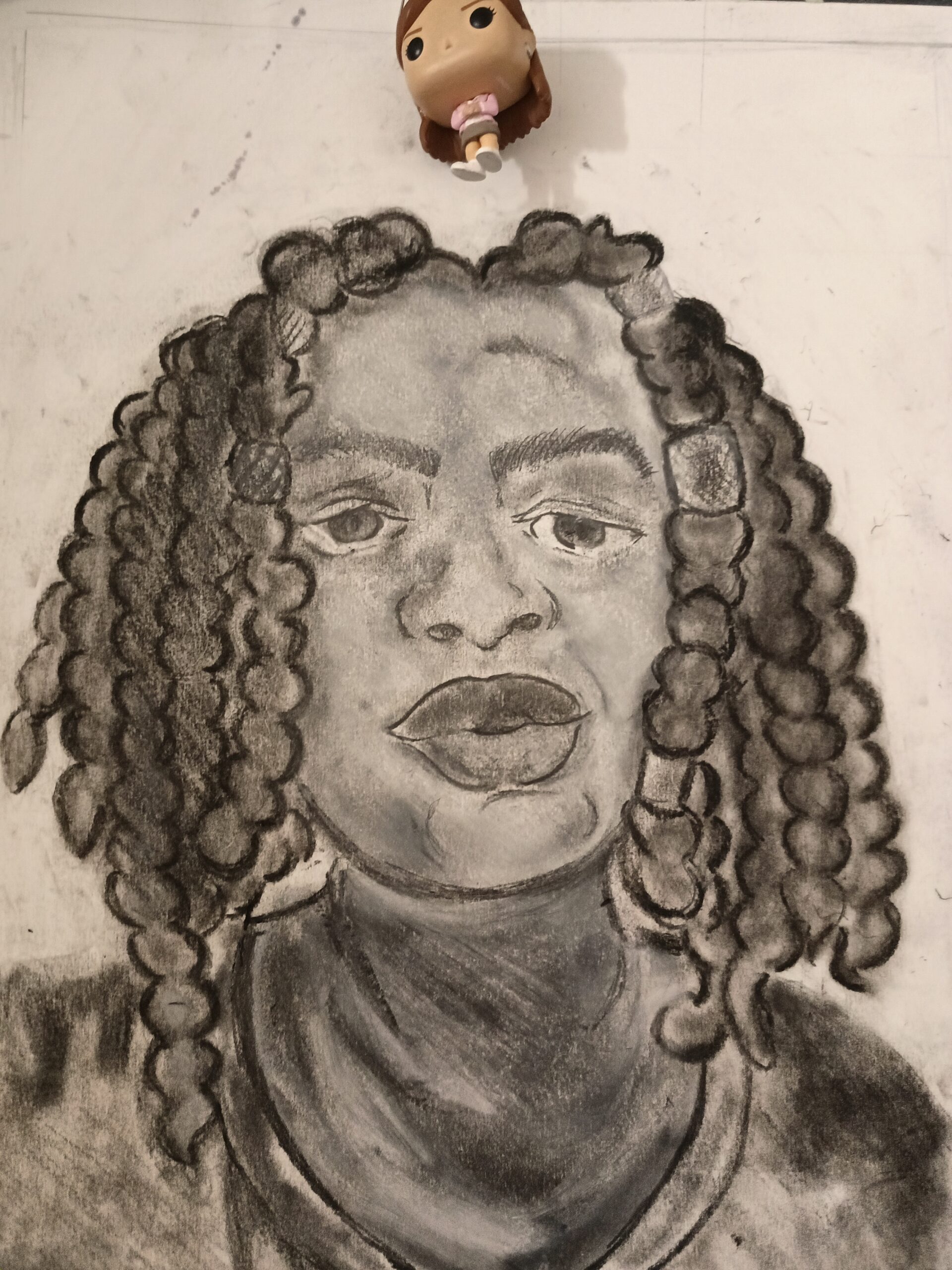
For my expressive self-portrait, I drew a photo of myself from the head to the top of the shoulders. As for materials, I used white conte crayon (used on the skin to clear it up) as well as black conte, 6B pencil (for outline), and compressed graphite.

I decided to use the grid method in order to help me plot everything out — I put my original photo through a grid and created the same grid on my paper. Using the grid made things a little easier at first, but once I got more accustomed to what I wanted and where I wanted it to go, I didn’t need the grid as much. (After all, I was drawing my face — I should know where everything is.)

I would say that the mass majority of my problems came with adding value with multiple mediums. Once I made the overall outline of the self-portrait, I was quite pleased with what I had made — it looked accurate — but once I added value using darker mediums (the black conte) it had completely changed the face and I could no longer tell that the facial expression in the drawing was like that in the reference photo.

All marks made during the planning/outlining stage are intentional, but lots of marks made during shading are not and are instead accidents that I decided to keep. I adjusted the eyes and the lips because the marks over them were too dark (there was no whiteness in the eyes, and once the lower lip was darker than the upper lip it looked like the facial expression/overall face had changed). Something that I incorporated into the drawing was the marks made in the butterfly locs (the hair); the overall way I shaded them was a mistake, but once it grew on me I decided to keep it as it was.

I spent approximately an hour planning and then 3 and a half hours working on the actual drawing (2 hours of outlining and the remainder was used for shading). I didn’t have any problems with choosing materials in the beginning — I wanted one pencil to help me do one thing, and that was outlining the self-portrait — but I may have been apprehensive when the first step was over. White conte was something I had on hand but I wasn’t sure if I even wanted to use it — I was afraid it’d make my work worse somehow. In the end, using it was one of my better ideas and served as a solution to the problem of how dark some of my shading was.

Interior Space Drawings

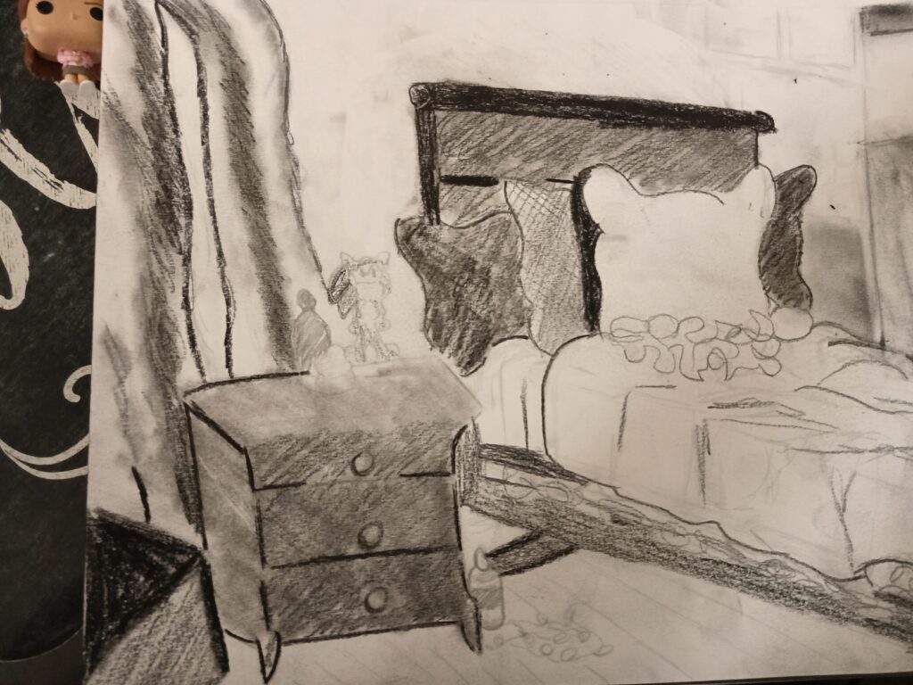
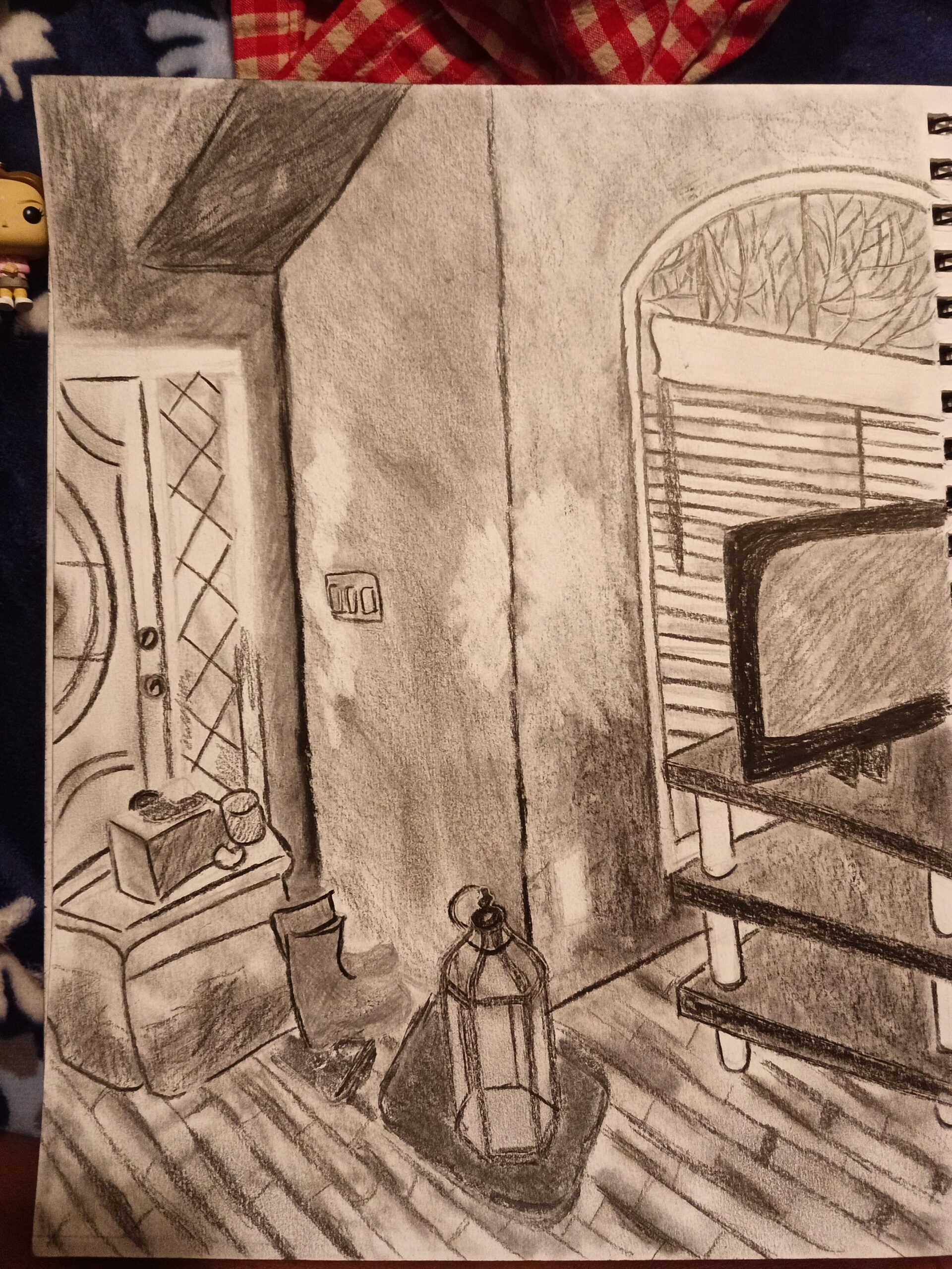
For my Interior Space assignment, I created two drawings — one drawing was preliminary and meant to experiment with mediums and the other was the final, more detailed drawing. The preliminary drawing consisted of a bed covered in pillows, a nightstand with a few decor items on top of it, and a portion of some hanging curtains. I chose to use only 6B and 8B graphite pencils for the preliminary. On the other hand, the final drawing was of a portion of the front room and consisted of the front door, the window in the living room, a television on top of a TV stand, two pairs of shoes on two mats, and a storage container on the ground. Since the final drawing was meant to be more sophisticated and organized, I used the 6B graphite pencil for outlining the objects, as well as the conte crayon and compressed charcoal.

I chose to outline everything in both drawings as lightly as possible, and because I made this choice, I did not have to go back and adjust the placement of any of the objects in the spaces. I did need to revisit areas in order to revise value, though. 

My primary challenge came with the overall perspective and value in both drawings. In terms of perspective, I initially had trouble deciding which space would be the preliminary and which would be the final and I struggled to focus my attention on one when the other seemed so much better. I had to keep walking away from the area of direct observation and coming back, but sometimes when I came back, I would be lost on what to do. To solve this, I started taking pictures of the area to remember the areas I stopped at. Additionally, value became an issue when I began using darker mediums to make darker areas in my work — areas that were too light did not reflect where the light (the sun or the light bulbs in the room) were coming from, and areas that were too dark were difficult to lighten up.

Not of all the marks that I made in my final drawing are not intentional. Some areas on the walls are darker than others, and some dark areas aren’t blended in enough. To compensate for all of these issues, I kept all these mistakes in the end because they were so difficult for me to get rid of.

I spent approximately half an hour looking for areas to photograph and an hour outlining the preliminary drawing. When it came to the actual drawing of both works, it took me about 3 hours. I struggled with the final drawing because sometimes staring at it for too long made me wonder whether or not I liked the area as my final drawing or as a potential preliminary drawing. In the end, I thought that making the front room area would be better for a final because by that time, I would have made better progress with the bedroom as the preliminary and I’d know which nediums would work best.

« Older posts

© 2026 Maleah Slade's Blog

Theme by Anders Noren — Up ↑

css.php