WordPress site by Maleah Slade

Category: ART 241

Self-Portraits (Final Paintings)

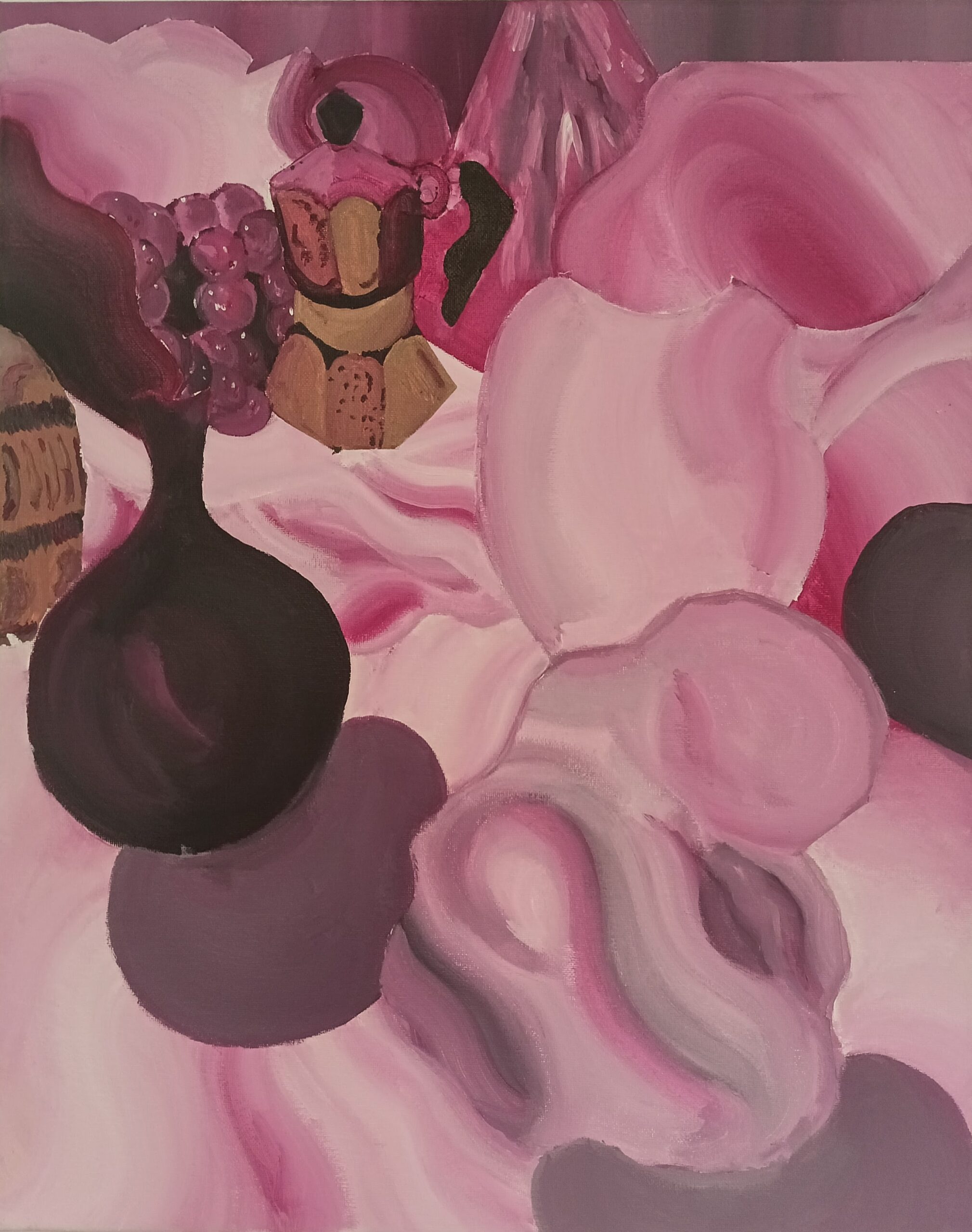
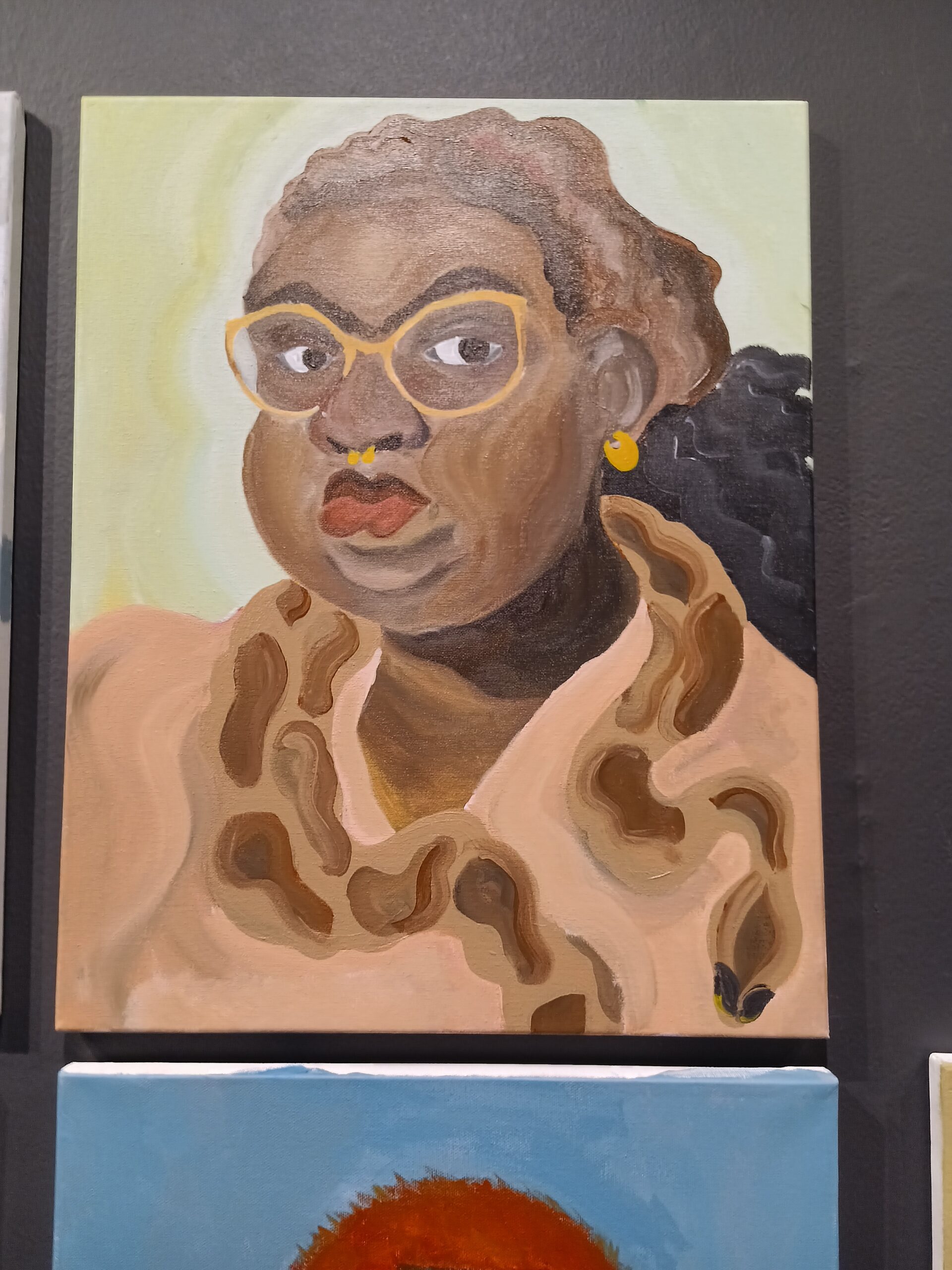
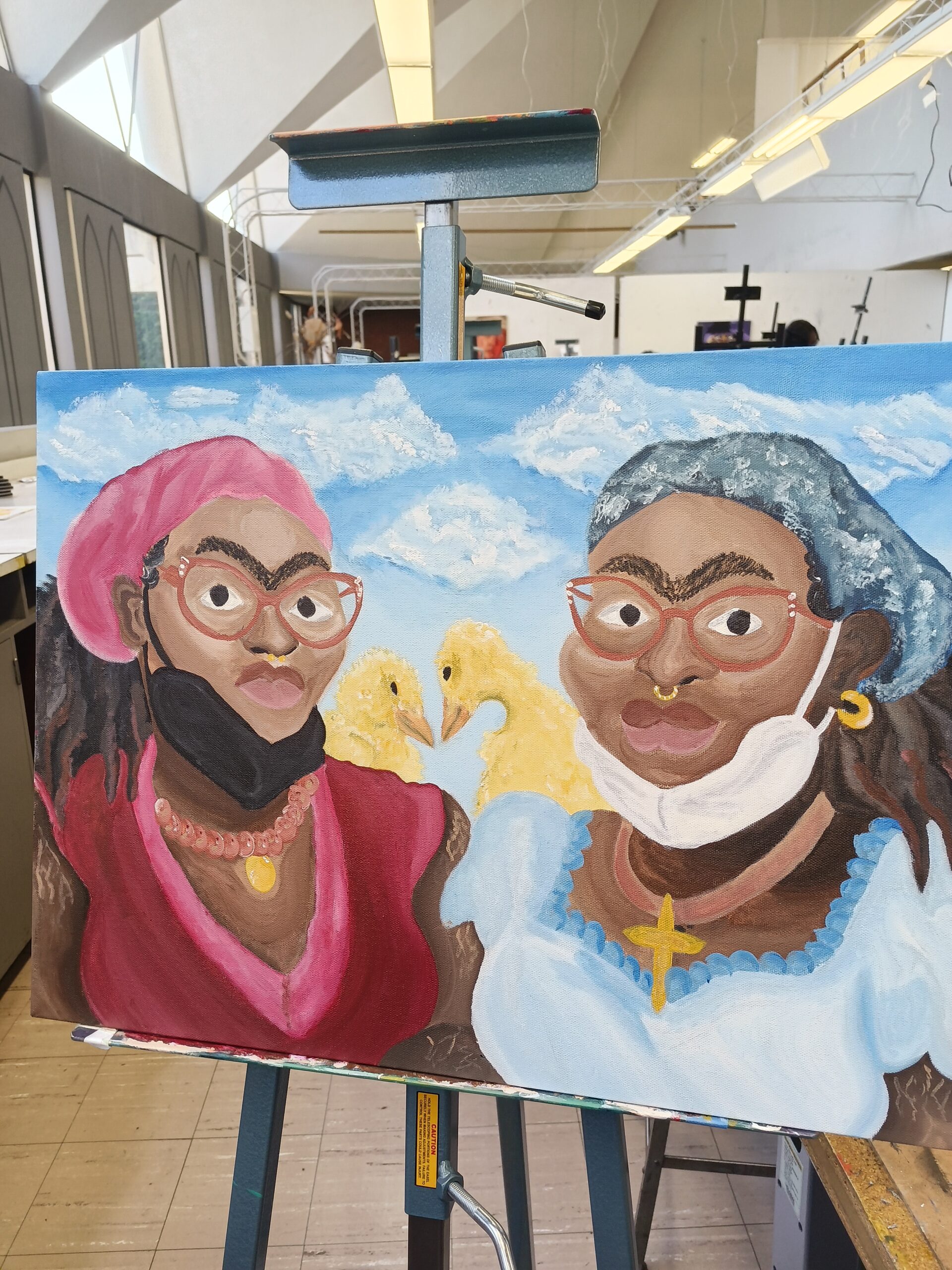
For my final paintings, I decided to make my self-portraits in the style of surrealist portraiture/still-life painter Frida Kahlo. I chose her style because I have always been fascinated with the realism of her portraits and the dream-like nature of her backgrounds. I wanted to focus on the aspects of her work that let people know that they’re viewing a work she created: the elongated neck, the tilted head with the forward facing eyes, the unibrow, and the nature-like background.

For both of my portraits, I lightly sketched out the idea in thin graphite, then painted it– starting with the background, then moving onto smaller and secondary subjects — the snake and the duck, then the skin and clothing and hair. As I was working on my paintings, I found myself blending warm and cool colors into my brown paint as often as possible, trying to get the correct shades of brown for my skin to show areas of highlight. This is my first time painting skin tones, and I wanted to incorporate my stretch marks, so this was an entirely new experience. I was also surprised at my ability to paint almost-realistic animals when I put in more work, as the ducks came out better than the snake.

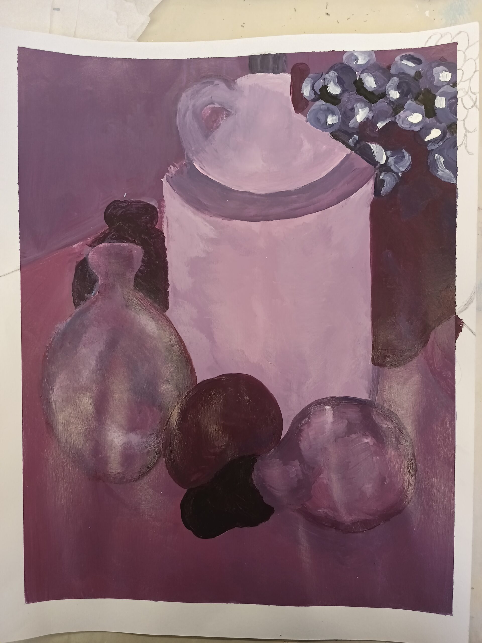
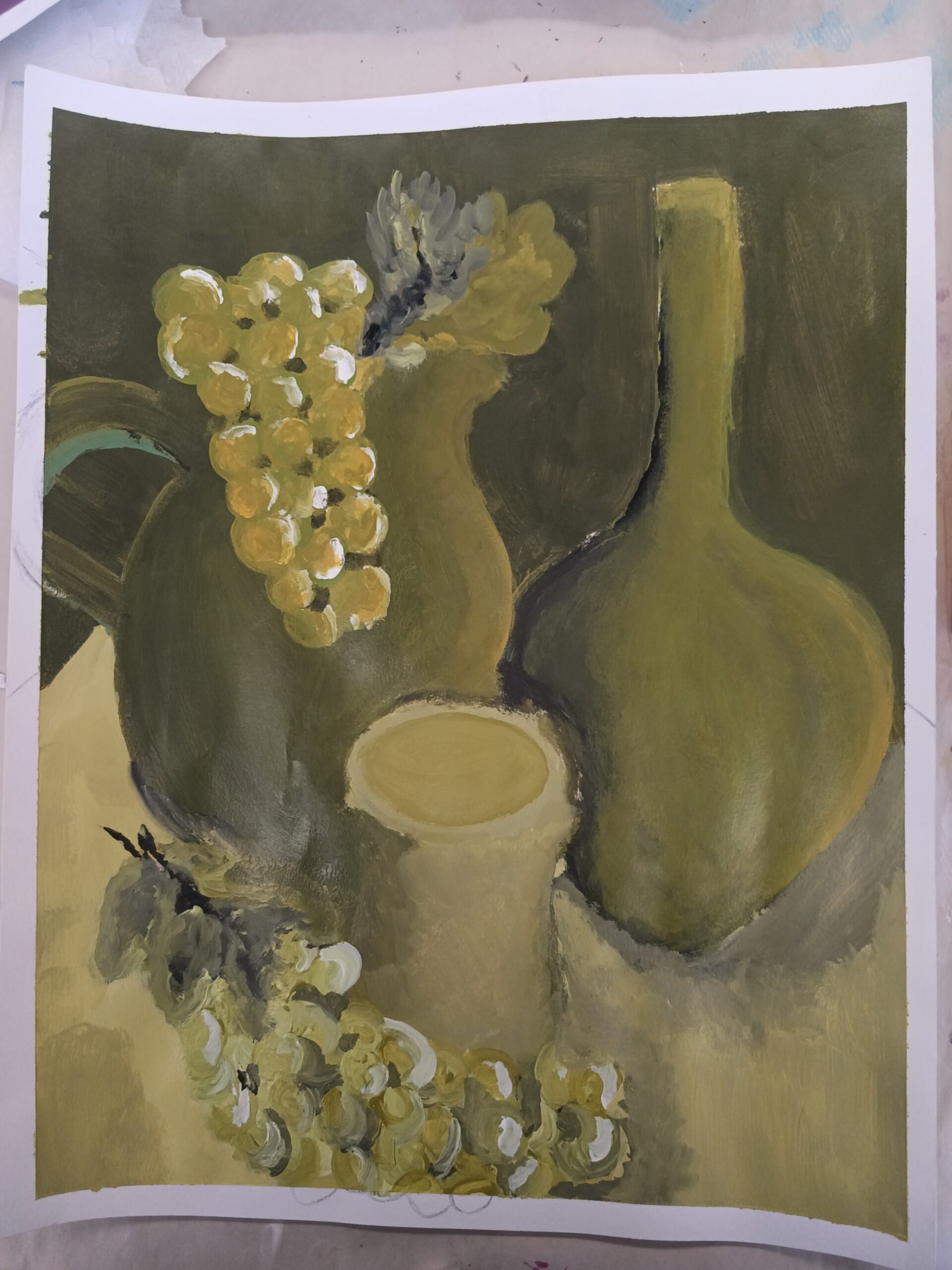
If I could start over, I would redo my entire first portrait (left) to incorporate as much of the time and effort and do-overs that I put into the second portrait (right). When I was working on the first one, I found myself reverting back into using the same wavy brushstrokes on my skin that I used for my still-life painting, which made it look less realistic and less like Kahlo’s style.

Limited Color Painting

For the limited color painting assignment, I created a still-life painting. The limited color scheme is a monochromatic palette created using the Quinacridone Magenta acrylic paint from Liquitex — every tint, shade, and tone was the product of adding black, white, grey (and even brown) to Quinacridone Magenta. Every object was initially drawn out on the canvas using paint diluted with acrylic medium, then layers of paint without acrylic were added after. Larger objects such as the open vase with grapes and transparent bottle were painted first, then came objects in the middle and bottom.

This time around I attempted to learn from my prior mistake and focus on areas of light and dark/shadow, so I put in many layers and tried to be more fluid with my brush strokes. I think that this may have worked on a lot of areas and let the more interesting objects (such as the student sculpture of the person in the front) become focal points. I was also able to define edges on many of my objects. Next time around, I want to work on my brushstrokes to make my work feel more realistic and make the subject appear less flat.

Color Exercise

For the first color exercise, I created four paintings of still-life’s. Two of the paintings consist of a monochromatic color palette (purples and greens), while the third was made in complementary colors (blue and orange) and the fourth was done in neutrals/greyscale. For each painting, the objects chosen for the reference were often rearranged or swapped out for other objects.

I decided to outline the objects for each painting in soft graphite instead of acrylic paint before color blocking the background and objects. Then, as I went through each object, I applied more layers as I worked to create areas of value in and around each object. I should have paid more attention to where the light source was coming from in each object and blended more carefully to create a better range of tints and shades for each color. In the case of the complementary colors painting, I should have taken more care to create a white border using artist tape; however, when I first started color blocking I did not think to do so. In the monochromatic purple painting, something I need to improve on is establishing more defined edges for each object so that they don’t clash with the foreground.

css.php