4 Drawings Midterm
MARCH 18, 2021 / CDVL / EDIT
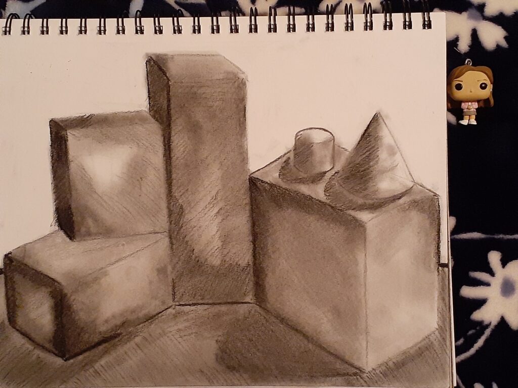
Drawing 1: Transitional Values 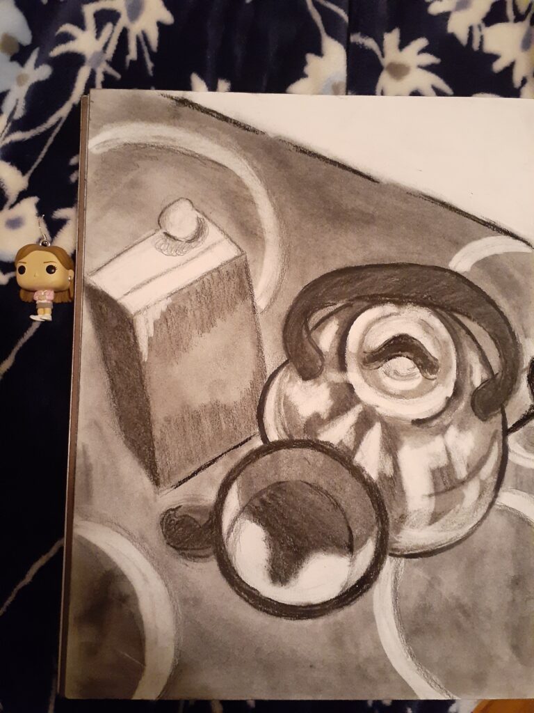
Drawing 2: Extreme Vantage Point (Looking Down) 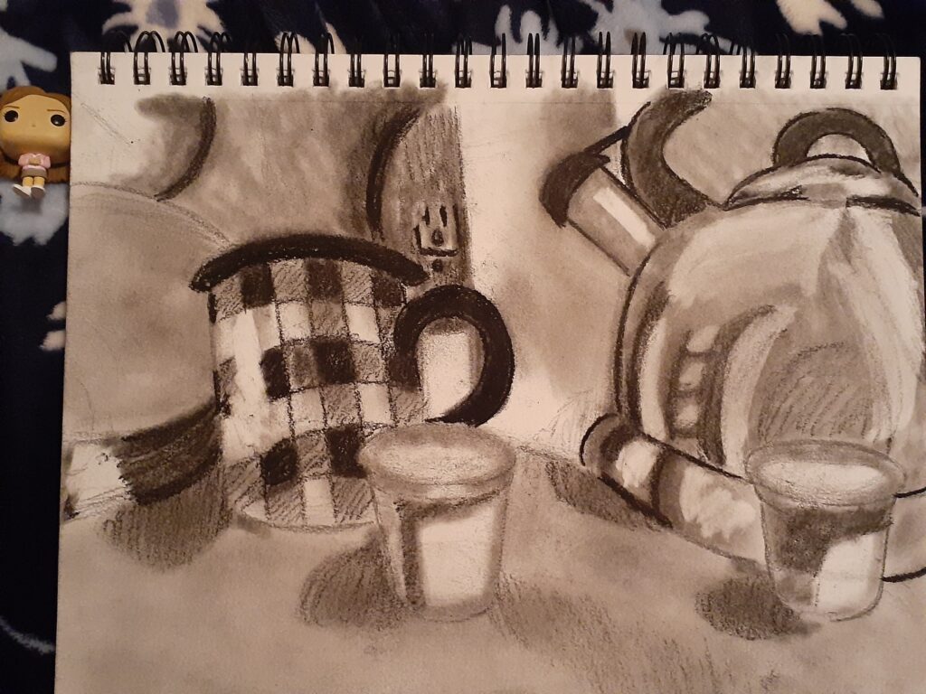
Drawing 3: Directional Line and Shape 
Drawing 4: Up Close but not Abstract
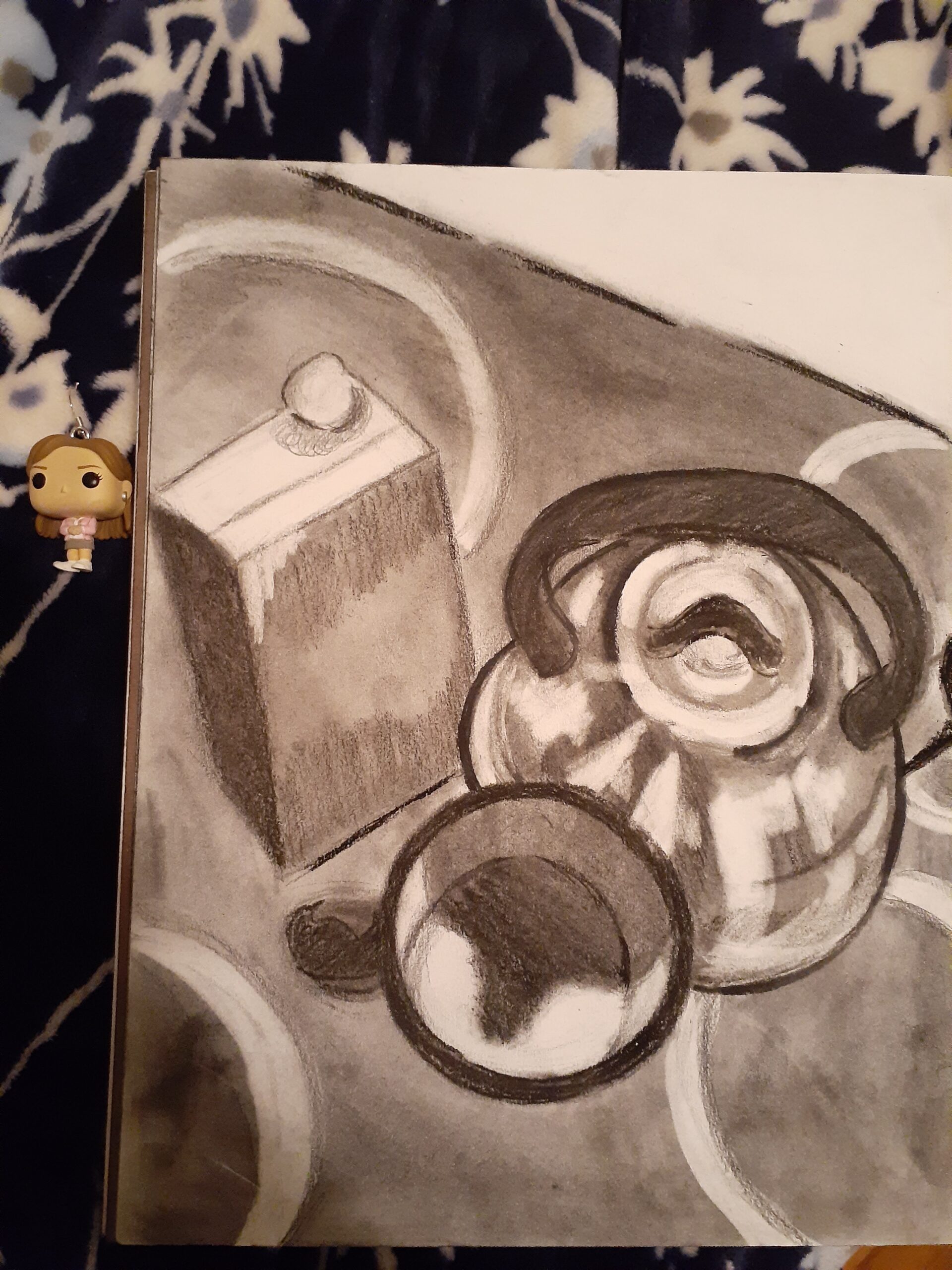
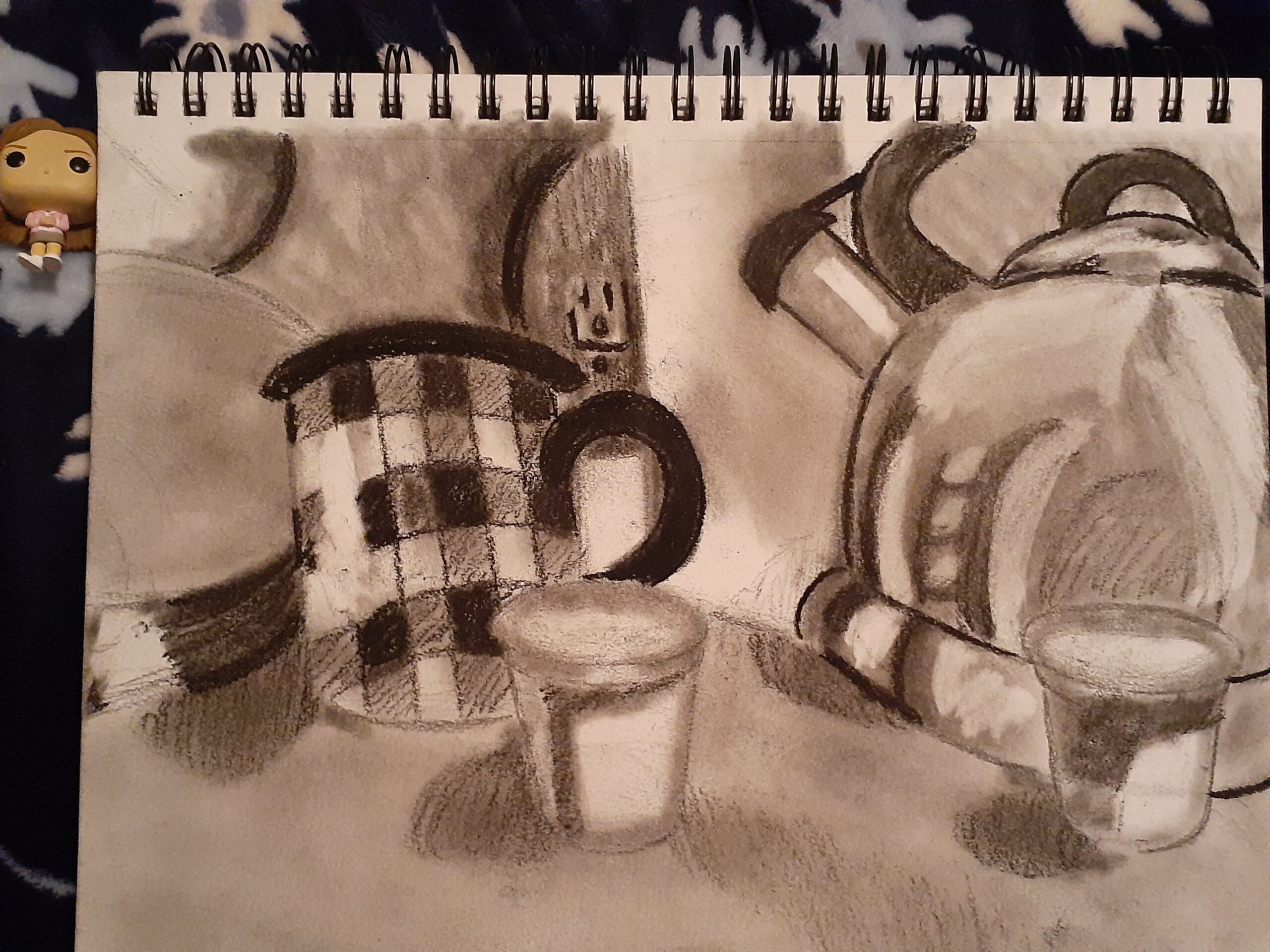
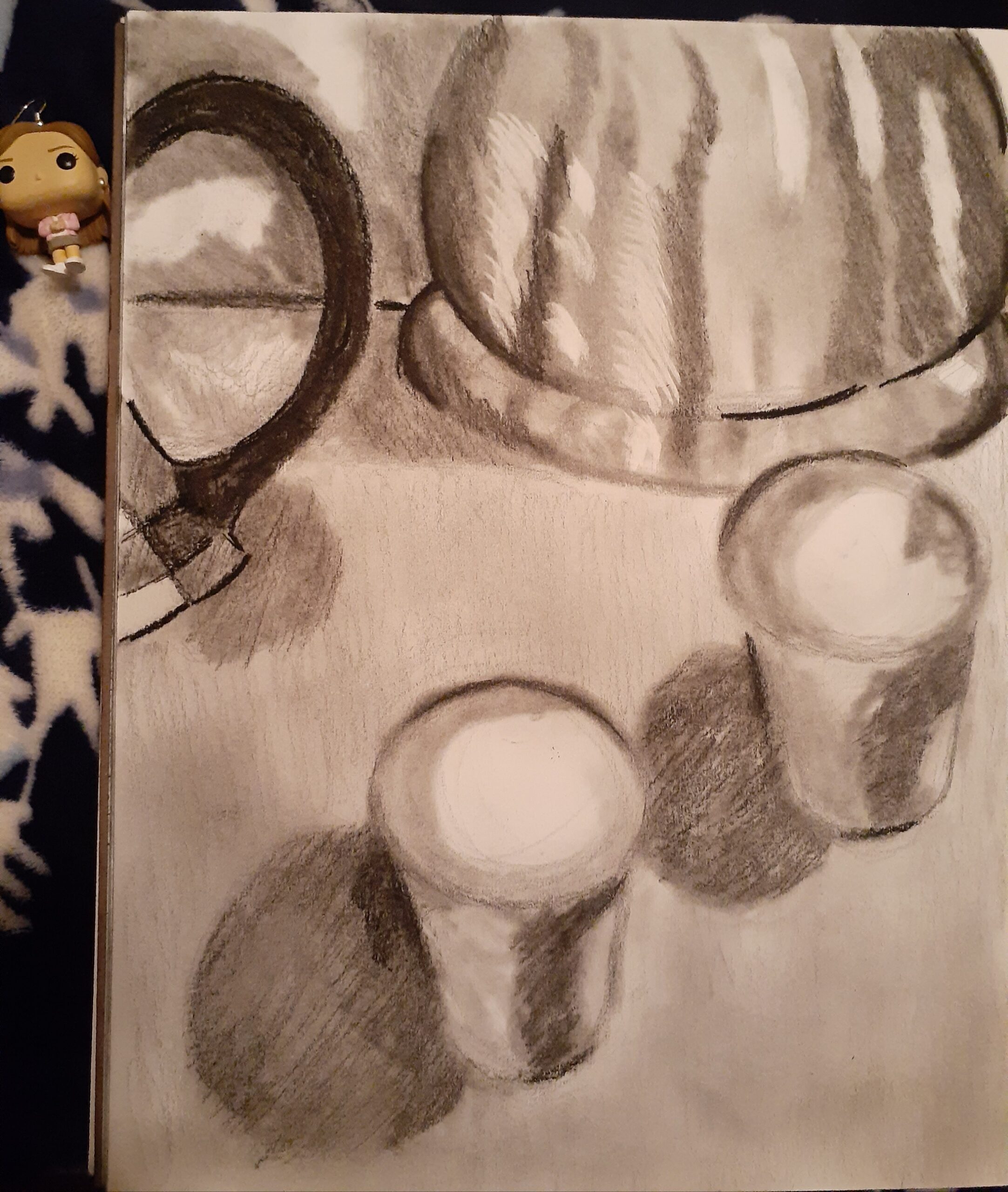
For my four midterm drawings, I chose to draw three various still lives of the same set-up and one still life composed entirely out of three-dimensional figures. The still life set-up that would be used for three of my midterm drawings consisted of a large tea kettle, a coffee mug, a box of tea, and small coffee pods. I elected to use the 6B and 8B graphite pencils, the mars lumograph pencil, the graphite stick, the vine charcoal, and the compressed charcoal. The charcoal was blended into the paper with the help of q-tips.
I chose to use graphite for general shapes and forms such as the tea kettle and the mug. On the other hand, I chose charcoal to show form and to work on areas that needed to be blended, such as dark areas and shadows in the foreground and the background. The shape of the tea kettle in the works that it appeared in was constantly being moved around, erased, and resized because it failed to look like a tea kettle (from the extreme vantage point drawing) or because it was too close to other objects.
I encountered issues with perspective, value, and shape. Objects were either too close or too spaced out. I had trouble finding the light source and so objects appeared flat, and other times they did not look anything like the direct reference. In order to solve the lighting problem for value, I took photos of my set-up and wrote down which direction the light was coming from lightly on my paper, so I would remember which areas were supposed to be darker and which were supposed to be lighter.
The majority of the marks made on the drawings are intentional and great care was taken for the mediums and materials, as well as for the marks that were not intentional — for example, any stray fingerprints made by the charcoal were erased with the gum eraser before the assignment was turned in. The stray light marks on the tea kettle (see close up photograph) were initially made accidentally, but because it helped to show where the lightest parts of the kettle were I elected to keep the marks and even add them to the other tea kettles in the other two drawings.
A lot of time was spent planning the locations of the objects and shapes out on the paper but even more time was spent finalizing the final shapes and applying areas of light and shadow. The planning process took one and a half hours but the working process must have taken twice or thrice as long, because I had to keep going back to fix my mistakes. Since this was taking too long, I had to sit myself down — as to avoid getting up and losing my focus whenever I needed to reposition myself or take a break so my hand wouldn’t cramp up — and go back to the planning process in order to reposition the location and sizes of the shapes. In the end, I think doing this made all the difference as I was able to complete all four drawings and make them look as realistic as possible.
Interior Space Drawings
APRIL 9, 2021 / CDVL / EDIT
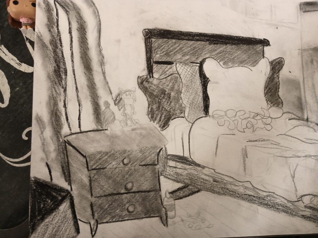
Interior Space Drawing 1 (Preliminary) 
Interior Space Drawing 2 (Final)
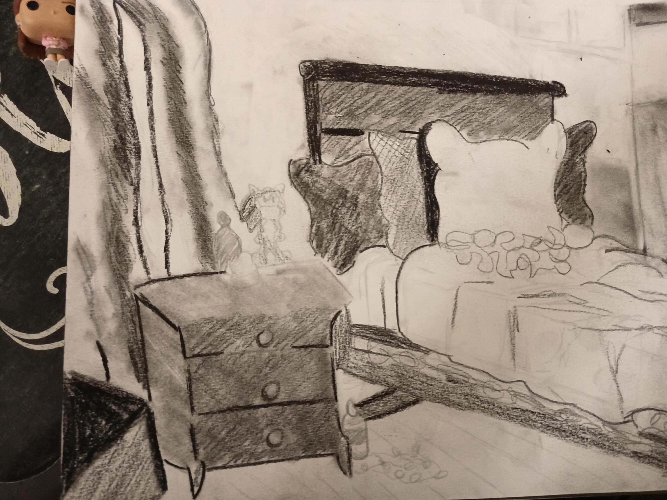
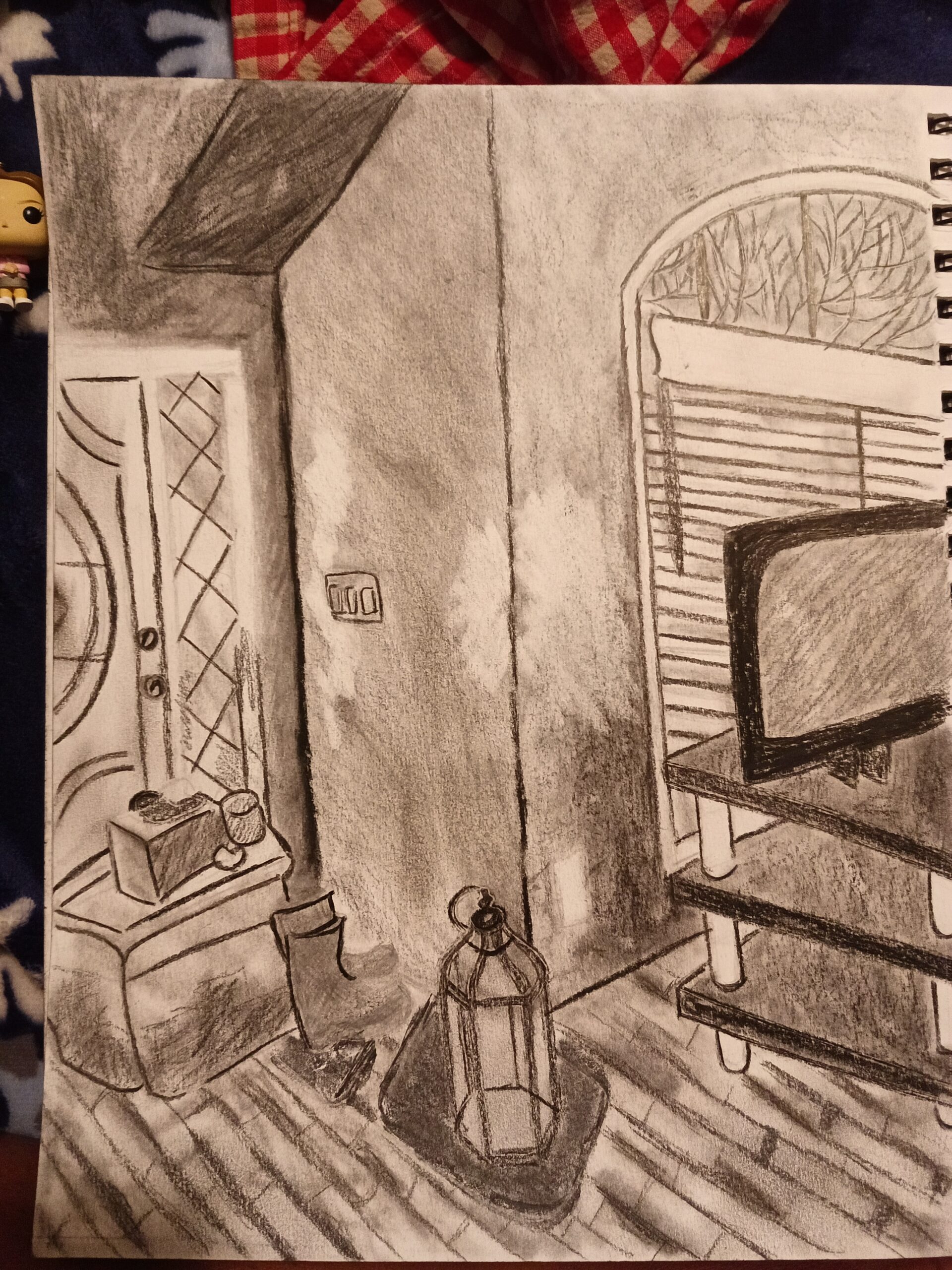
For my Interior Space assignment, I created two drawings — one drawing was preliminary and meant to experiment with mediums and the other was the final, more detailed drawing. The preliminary drawing consisted of a bed covered in pillows, a nightstand with a few decor items on top of it, and a portion of some hanging curtains. I chose to use only 6B and 8B graphite pencils for the preliminary. On the other hand, the final drawing was of a portion of the front room and consisted of the front door, the window in the living room, a television on top of a TV stand, two pairs of shoes on two mats, and a storage container on the ground. Since the final drawing was meant to be more sophisticated and organized, I used the 6B graphite pencil for outlining the objects, as well as the conte crayon and compressed charcoal.
I chose to outline everything in both drawings as lightly as possible, and because I made this choice, I did not have to go back and adjust the placement of any of the objects in the spaces. I did need to revisit areas in order to revise value, though.
My primary challenge came with the overall perspective and value in both drawings. In terms of perspective, I initially had trouble deciding which space would be the preliminary and which would be the final and I struggled to focus my attention on one when the other seemed so much better. I had to keep walking away from the area of direct observation and coming back, but sometimes when I came back, I would be lost on what to do. To solve this, I started taking pictures of the area to remember the areas I stopped at. Additionally, value became an issue when I began using darker mediums to make darker areas in my work — areas that were too light did not reflect where the light (the sun or the light bulbs in the room) were coming from, and areas that were too dark were difficult to lighten up.
Not of all the marks that I made in my final drawing are not intentional. Some areas on the walls are darker than others, and some dark areas aren’t blended in enough. To compensate for all of these issues, I kept all these mistakes in the end because they were so difficult for me to get rid of.
I spent approximately half an hour looking for areas to photograph and an hour outlining the preliminary drawing. When it came to the actual drawing of both works, it took me about 3 hours. I struggled with the final drawing because sometimes staring at it for too long made me wonder whether or not I liked the area as my final drawing or as a potential preliminary drawing. In the end, I thought that making the front room area would be better for a final because by that time, I would have made better progress with the bedroom as the preliminary and I’d know which mediums would work best.
Expressive Self Portrait
APRIL 25, 2021 / CDVL / EDIT
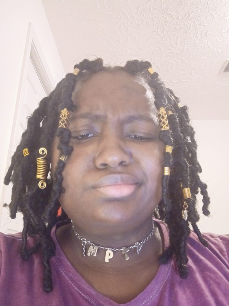
Reference Photo 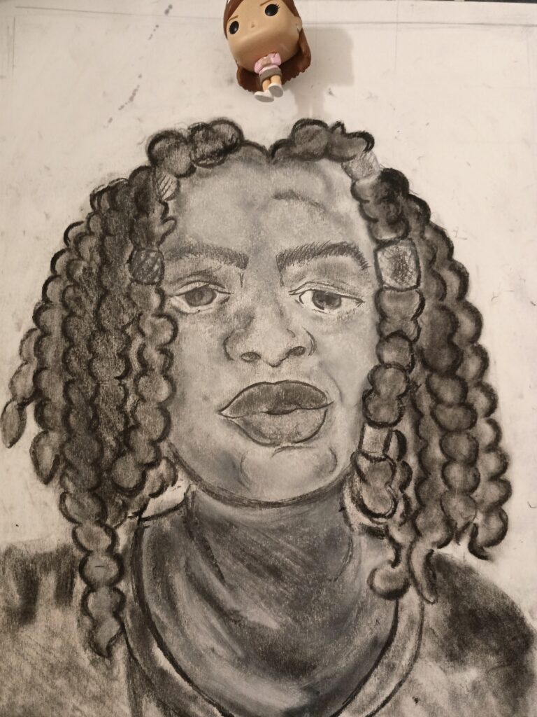
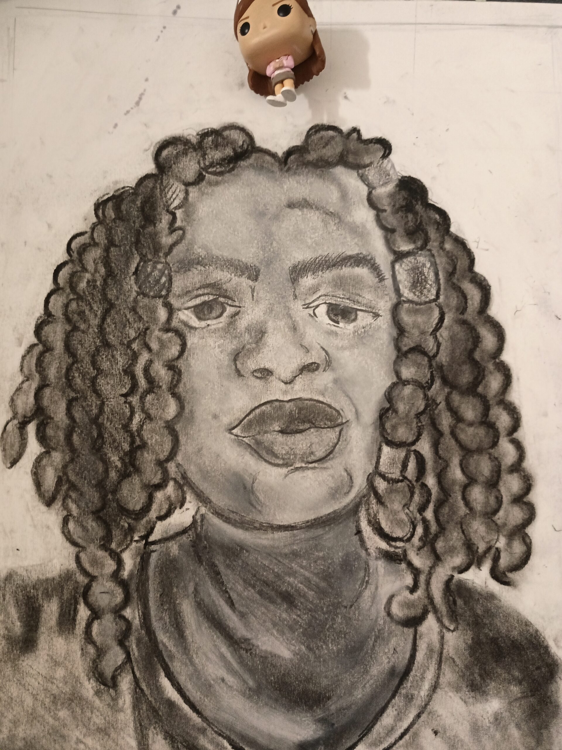
Actual Drawing

General description-what did you draw and what materials did you use?
For my expressive self-portrait, I drew a photo of myself from the head to the top of the shoulders. As for materials, I used white conte crayon (used on the skin to clear it up) as well as black conte, 6B pencil (for outline), and compressed graphite.
I decided to use the grid method in order to help me plot everything out — I put my original photo through a grid and created the same grid on my paper. Using the grid made things a little easier at first, but once I got more accustomed to what I wanted and where I wanted it to go, I didn’t need the grid as much. (After all, I was drawing my face — I should know where everything is.)
I would say that the mass majority of my problems came with adding value with multiple mediums. Once I made the overall outline of the self-portrait, I was quite pleased with what I had made — it looked accurate — but once I added value using darker mediums (the black conte) it had completely changed the face and I could no longer tell that the facial expression in the drawing was like that in the reference photo.
All marks made during the planning/outlining stage are intentional, but lots of marks made during shading are not and are instead accidents that I decided to keep. I adjusted the eyes and the lips because the marks over them were too dark (there was no whiteness in the eyes, and once the lower lip was darker than the upper lip it looked like the facial expression/overall face had changed). Something that I incorporated into the drawing was the marks made in the butterfly locs (the hair); the overall way I shaded them was a mistake, but once it grew on me I decided to keep it as it was.
I spent approximately an hour planning and then 3 and a half hours working on the actual drawing (2 hours of outlining and the remainder was used for shading). I didn’t have any problems with choosing materials in the beginning — I wanted one pencil to help me do one thing, and that was outlining the self-portrait — but I may have been apprehensive when the first step was over. White conte was something I had on hand but I wasn’t sure if I even wanted to use it — I was afraid it’d make my work worse somehow. In the end, using it was one of my better ideas and served as a solution to the problem of how dark some of my shading was.
Final Drawings
MAY 7, 2021 / CDVL / EDIT
Final Drawing 1 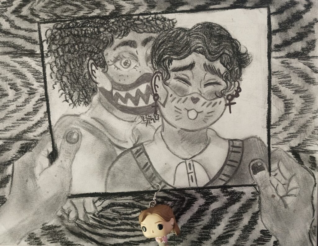
Final Drawing 2
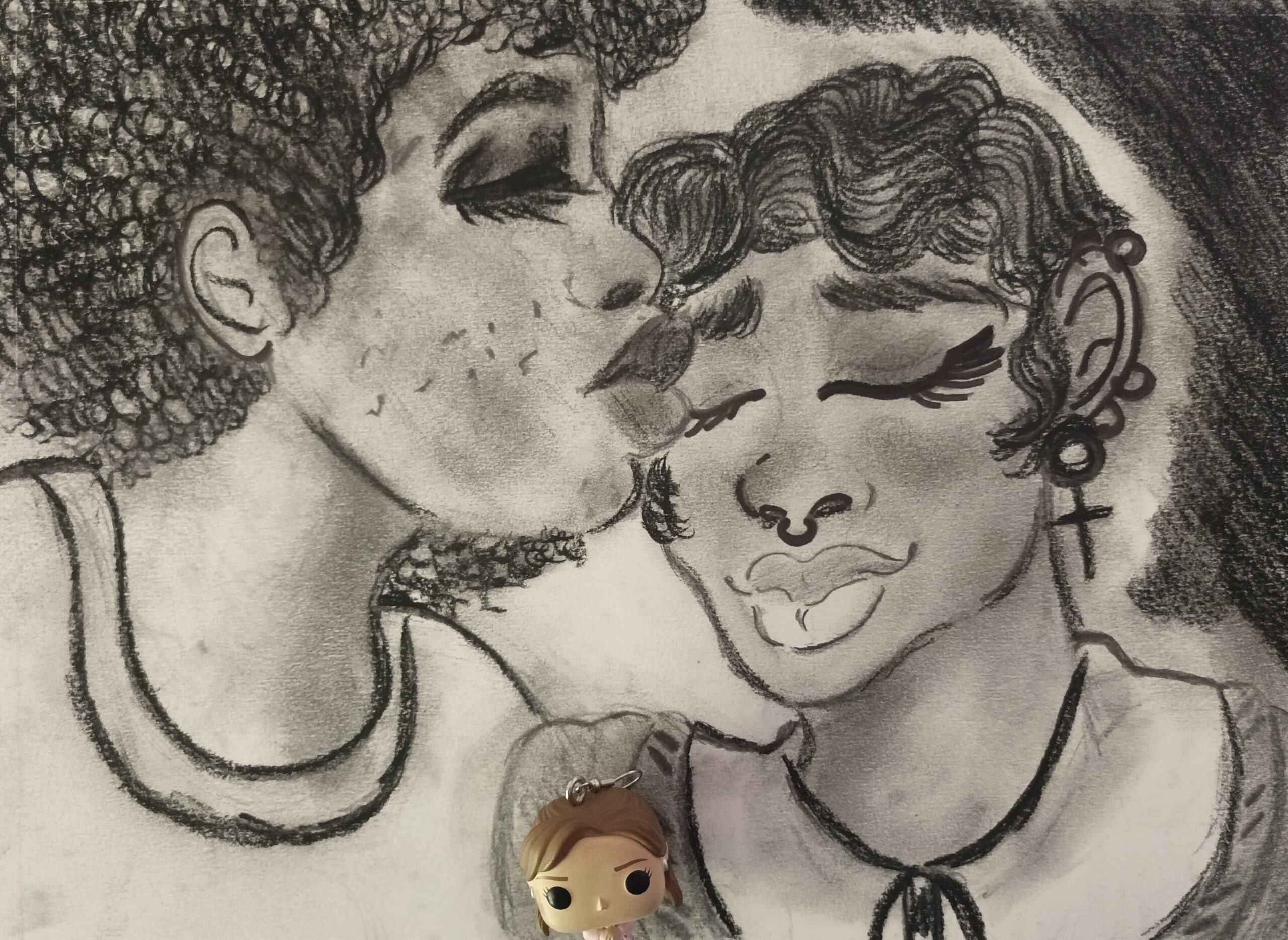
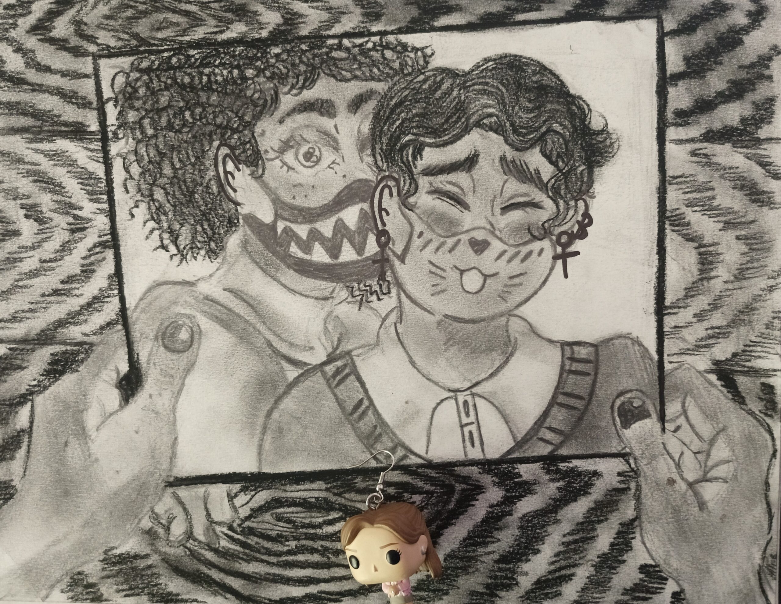
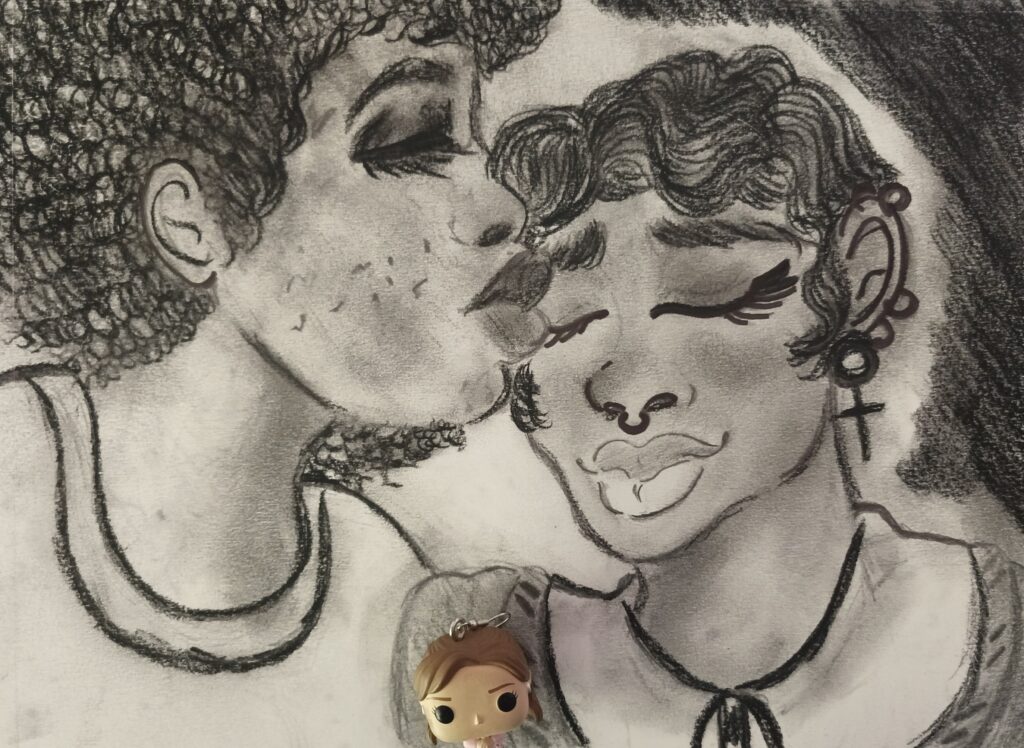
For my final two drawings, I chose to focus on the prompt of narrative. The narrative I selected surrounded lovers in quarantine and feelings surrounding separation — as lots of people in love had to keep away from each other when the COVID-19 lockdown began. For the first drawing, I drew two black/African-American individuals in a romantic embrace in which one is kissing the other. This represented the time prior to the lockdown in which people roamed freely and were able to hold one another without fear of passing on the virus. For the second drawing, I drew two hands holding a picture of the same two people, but in the photo they were wearing masks. This was made to represent the time during the pandemic when areas began releasing mask mandates and lockdowns/periods of quarantine. For both works, I used a 6B and 8B graphite pencil as well as a black conte crayon.
For the second drawing, I chose to use a lot of lines in the background — to create a similar texture/pattern to that of a wood surface — after seeing how empty it was behind the photograph. I found myself going back and forth between both drawings to adjust the skin tones of the two individuals to make sure the values were the same.
Something that was a challenge for me was texture — prior to this assignment I had never really drawn curly hair before and I had no idea how to. I wanted to signify that the two figures were African American not only through skin tone/value, but also through their hair (pattern/texture). I had to pull up more reference photos to figure out how to give the illusion of curls and coils. Additionally, I struggled with perspective — how could I demonstrate in the second drawing that the two individuals from the first were still seeing each other? The first idea was to have one on a laptop calling the other person, but I was displeased with it and decided not to go with it.
Most of my marks in both of the drawings are intentional — this includes the curls and coils of the hair. I didn’t have many problems with craftsmanship — I made sure of that by using lighter mediums this time around — but I did incorporate some marks into the drawing. For example, the dark color of the wooden surface in the second drawing was caused by accidental smudging of the black conte. Originally, I didn’t mean to smudge or blend the conte into the background, but after seeing how there weren’t a lot of dark areas, I decided to roll with it and keep on going.
I spent approximately 3 days in the brainstorming phase (brainstorming was due on the 21st but I needed an extra day to think some more). After the 22nd of April, I took an hour and a half each day (from the 23rd to 26th) in the planning phase. I ended up with a portion of the second drawing by the 26th that I was hesitant to post because I didn’t like how silly/cartoonish it looked — I wanted the body to look more semi-realistic. I ended up posting it, but later I scrapped it and started over with the photograph idea for the second drawing. After that, I took about two to three hours each day working on each drawing, constantly going back and forth to make sure the individuals looked the same. After settling on a skin tone, I struggled with deciding on other mediums because I didn’t want to mess up on what I already had. I decided that if I went too dark — compressed charcoal or vine charcoal — then I’d most likely ruin the work, so I settled on the conte stick for the curly hair.