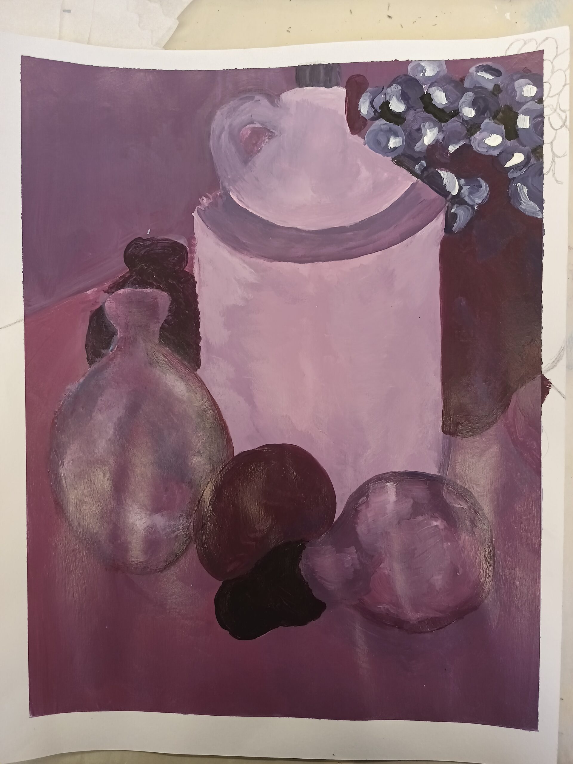
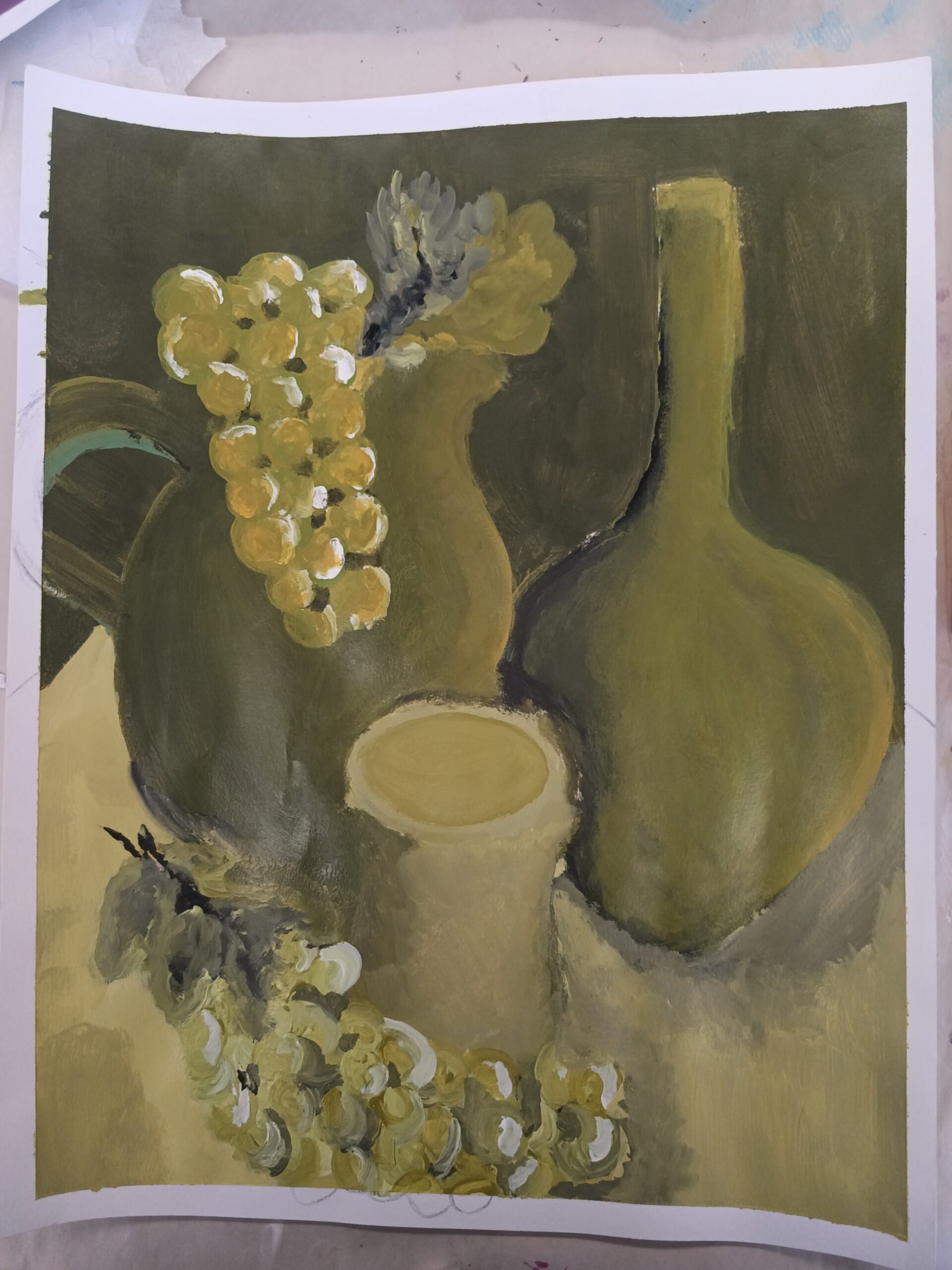
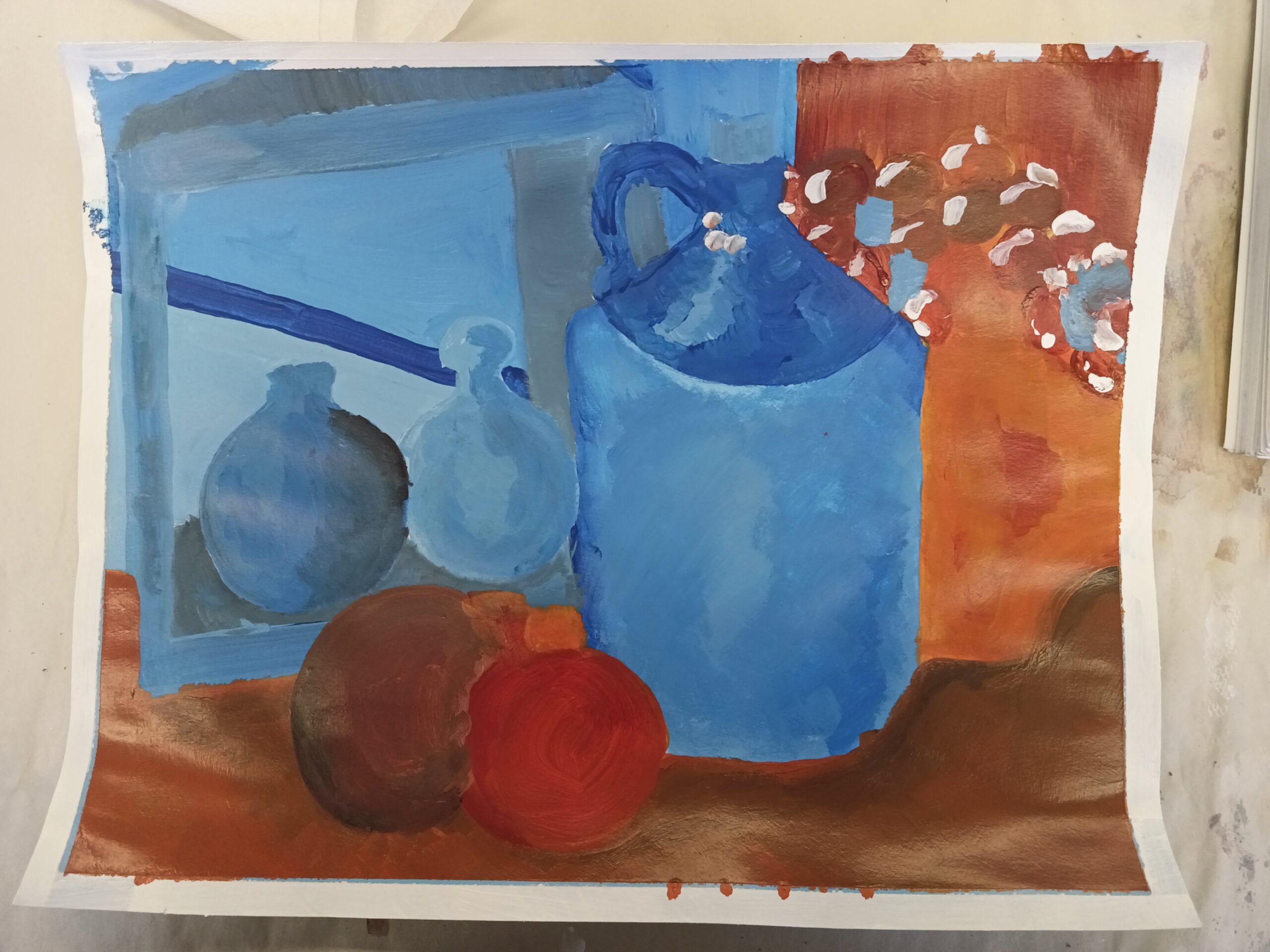
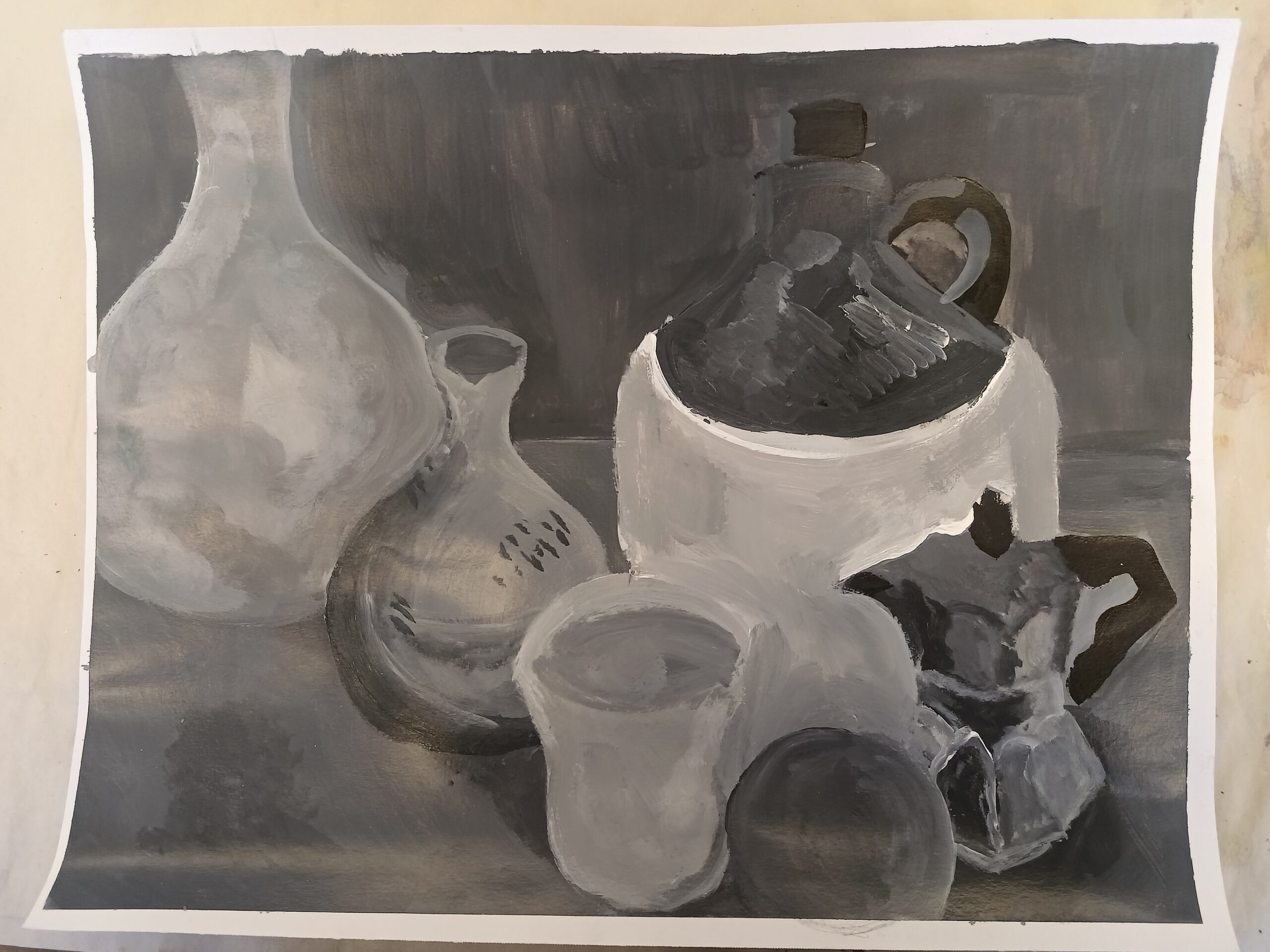
For the first color exercise, I created four paintings of still-life’s. Two of the paintings consist of a monochromatic color palette (purples and greens), while the third was made in complementary colors (blue and orange) and the fourth was done in neutrals/greyscale. For each painting, the objects chosen for the reference were often rearranged or swapped out for other objects.
I decided to outline the objects for each painting in soft graphite instead of acrylic paint before color blocking the background and objects. Then, as I went through each object, I applied more layers as I worked to create areas of value in and around each object. I should have paid more attention to where the light source was coming from in each object and blended more carefully to create a better range of tints and shades for each color. In the case of the complementary colors painting, I should have taken more care to create a white border using artist tape; however, when I first started color blocking I did not think to do so. In the monochromatic purple painting, something I need to improve on is establishing more defined edges for each object so that they don’t clash with the foreground.